
Kestrel AI Search & Filter user guide
Everything the app does, page by page, with what each option means and its default. Use the contents to jump to a feature.
Getting started
Install the app, let it sync your catalog, then add it to your theme. Nothing changes on your storefront until you turn on the app embed.
Install and first sync#
When you install, the app downloads your products, variants and collections from Shopify. The first products become searchable within about a minute; a full catalog usually takes a few minutes. You can follow progress under Settings → Catalog & sync.
Only products that are Active and published to the Online Store sales channel are synced. Drafts, archived products and products hidden from the Online Store never appear in search.
Turn on the app embed#
The app embed adds instant search to your theme's existing search box. Turn it on in the theme editor: Online Store → Themes → Customize → App embeds → Kestrel AI Search, then save. The Setup guide on the app's Overview page has a button that opens this screen for you.
| Option | What it does | Default |
|---|---|---|
| Instant search dropdown | Shows products, suggestions, collections and (if enabled) pages and blog posts while shoppers type in the search box. It replaces the theme's own search suggestions; if the search service can't be reached, the theme's suggestions come back. | On |
| Search input selector | A CSS selector for your search box. Only needed if your theme uses a custom search field the app doesn't find on its own. | Empty (the theme's search form) |
| Buttons that open instant search | Only needed for themes the app doesn't recognise. On Shopify's free themes (the Horizon and Dawn families) the header search icon already opens the app's search panel instead of the theme's own search, and so does Cmd+K on Horizon. For another theme, enter a CSS selector, for example .header__icon--search. Theme developers can also add data-searchapp-instant-open to any button. | Empty |
| Connection | How the storefront reaches the search service. Automatic calls the Search API through its CDN, which is faster, and switches to your store domain (app proxy) for the rest of the page if that fails. Keep the default unless support asks you to change it. | Automatic |
| App proxy path | The path of the app proxy on your store. Change it only if you changed the app proxy in Shopify. | /apps/search |
| Storefront API endpoint (advanced) | Leave empty. Used only for special setups that support asks for. | Empty |
| Load the developer SDK on every page | Loads window.Kestrel on every page, for theme developers who call it on pages without the app's blocks. | Off |
If the search service is ever unavailable, your theme's own search keeps working. Shoppers always see products.
Add the Search results block#
The Search results block shows results, filters and sorting on your search page. In the theme editor, open the Search template, choose Add block → Apps → Search results, then save. Your theme's own results are printed first and stay as a fallback.
| Option | What it does | Default |
|---|---|---|
| Products per row (desktop) | Number of products per row on desktop (2–6). Tablets show up to 3 per row. | 4 |
| Products per row (mobile) | Number of products per row on phones (1 or 2). | 2 |
| Products per page | How many products load per page (12–48). | 24 |
| Pagination | Numbered pages: page numbers with Previous and Next. Show more button: a button under the products adds the next page below the ones already shown. Infinite scroll: the next page loads by itself as the shopper scrolls down, with the app's own button text and colors. | Numbered pages |
| Button label | Text of the Show more button. Empty uses the app's text under Appearance → Text & labels (translated per store language). Only shown when Pagination is Show more button. | Empty |
| Button text color / Button background / Button background on hover | Colors of the Show more button. Empty uses the accent color set under Appearance. Only shown when Pagination is Show more button. | Empty |
| Filter position | Left: a filter column next to the products. Top: a row of dropdowns above the products. Drawer: a Filters button that opens a panel. None: no filters from the app (use when your theme shows its own). On phones, filters always open in a panel. | Left |
| Show applied filters | Shows a chip above the products for each chosen filter value (click it to remove that value), with Clear all. When off, a Clear all link sits next to the result count on desktop; on phones, Reset filters is in the filter panel. | On |
| Show sort dropdown | Shows the Sort by menu above the results. | On |
| Default sort | The sort order used when the page opens. App setting uses the default chosen in the app under Search & filters → Sorting. | App setting |
Add the Collection filters block#
The Collection filters block adds filters and sorting to collection pages. Open the Collection template in the theme editor, choose Add block → Apps → Collection filters, then save. It has the same settings as the Search results block, except that Default sort offers Featured (the collection's own order) instead of Relevance.
On your storefront
What shoppers see once the app embed and the blocks are on.
Instant search dropdown#
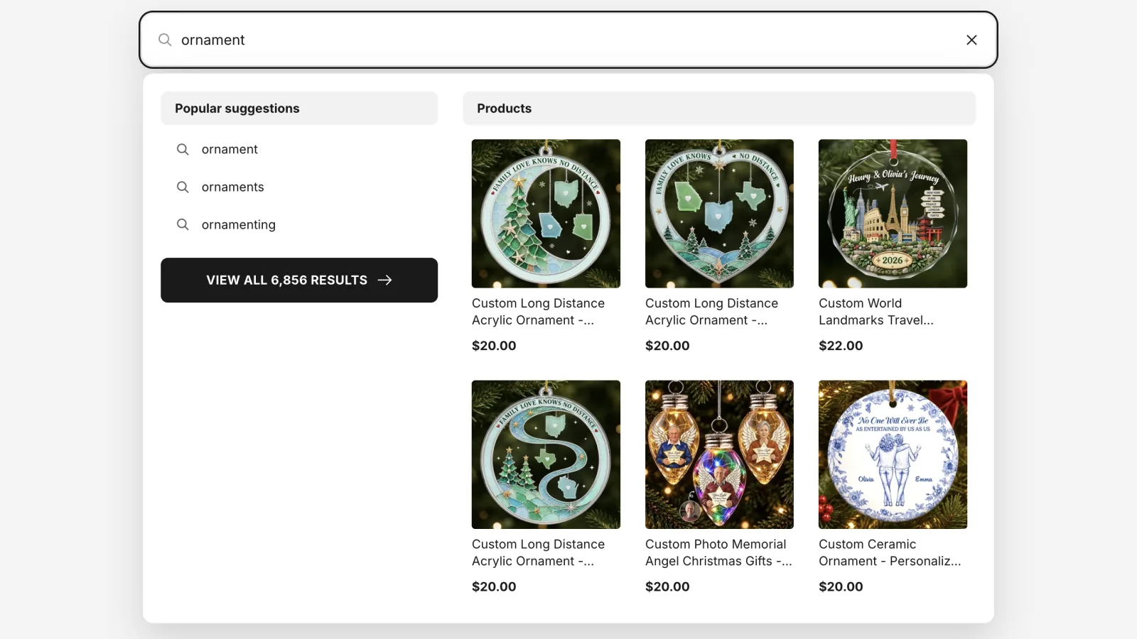
The dropdown opens under your theme's search box after 2 characters, or as soon as a shopper clicks into the empty box when you turn on Open the dropdown before the shopper types (Search & filters → Search → Search dropdown). On desktop it has two columns: on the left, keyword suggestions (your pinned searches first, then popular ones), matching collections, pages and blog posts and a View all button with the number of results; on the right, matching products with their price. The dropdown searches exactly like the results page: the number on View all is the number the results page shows, written the same way, and its products are the first products of the results page, in the same order. It stays the same while the shopper types and is centred under the search box: at least 960 px wide, or as wide as the search box when that is wider.
On phones (screens up to 749 px wide) it is one column: keyword suggestions, then products, then a full-width View all button. Products show as a list of rows on phones and as a grid on desktop unless you choose otherwise; how many products and keyword suggestions each device shows is also set under Appearance → Search dropdown layout.
Shoppers can move through it with the arrow keys, open an item with Enter and close it with Escape. If the search service doesn't answer, pressing Enter still opens your theme's search page.
A button set up to open instant search (Buttons that open instant search in the app embed) shows a search panel at the top of the page over a dimmed background, with the cursor in its search box. Results appear as shoppers type, as in the dropdown. Escape, the close button or a click outside the panel closes it.
Search results and collection pages#
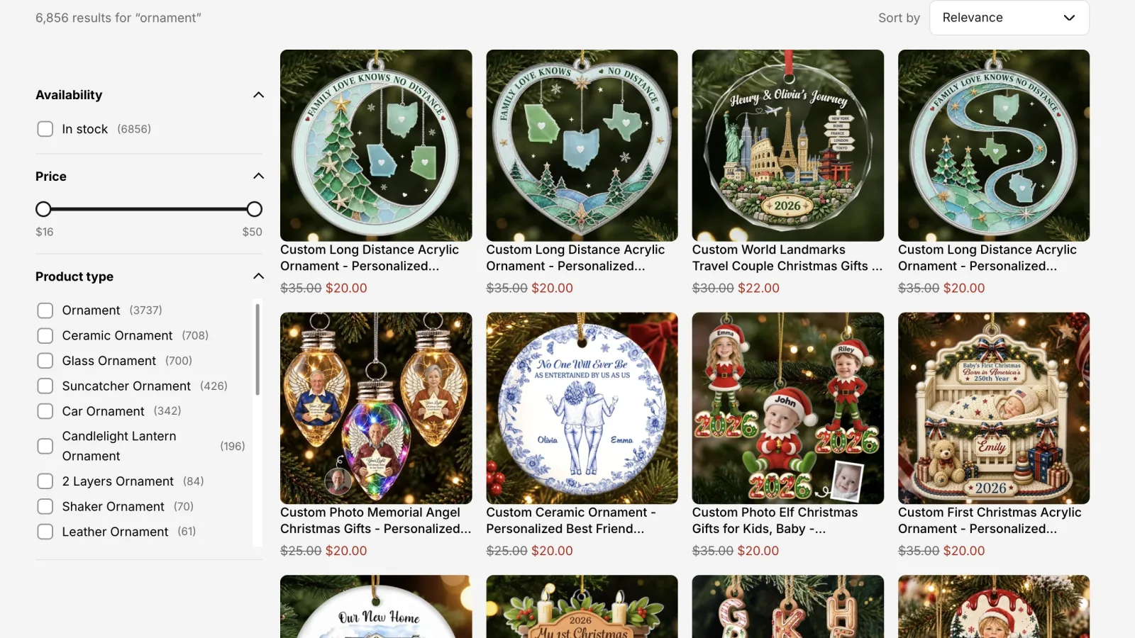
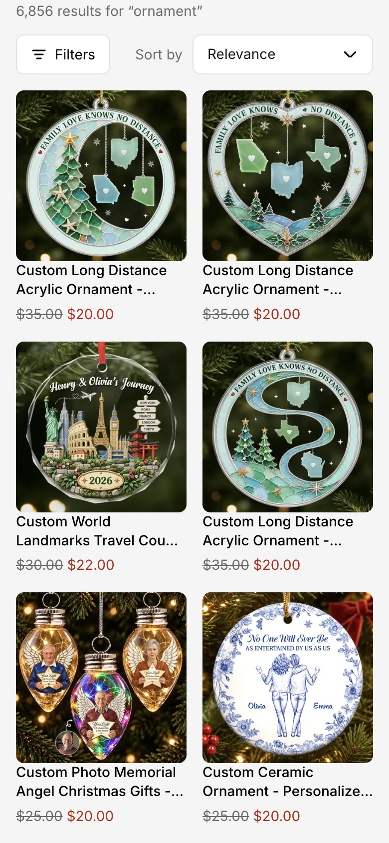
The page first shows your theme's own results, then the app takes over without reloading: filters (where the block's Filter position puts them), the result count, the Sort by menu and, depending on the block's Pagination, numbered pages with Previous and Next, a Show more button, or more products loading as the shopper scrolls. Selected filters appear as chips above the products, with Clear all.
On the search page, the browser tab title follows the app's result count too: it reads like the count on the page (for example “6,872 results for “ornament””, or the no-results title), followed by your store name when your theme's title ends with it. Themes write that title from Shopify's own search, whose count can differ from the app's. Collection pages keep the theme's title.
Filters, sort order and page number are kept in the address, so shoppers can share a filtered page and the Back button works. Show more and infinite scroll don't add a page number: reopening the link starts from the first products with the same filters. On phones, a Filters button opens a panel with a button that shows how many products match and a Reset filters button.
Redirects and search notices#
A search that matches a redirect (Search & filters → Merchandising → Redirects) opens that page instead of results. In the search dropdown, such a search shows no count, and View all or Enter opens the page directly. When Turn words into filters is on and a search is read as filters, a notice above the results offers a link to search the exact words instead.
Prices and currencies#
Prices come from Shopify for each shopper's market, including fixed market prices. If a price can't be confirmed in time, the product shows a placeholder (“View price” by default, changeable under Appearance) instead of a wrong amount.
Overview
Your starting point: setup progress, theme status, sync status and a summary of the last 7 days with a chart and the top searches.
Setup guide#
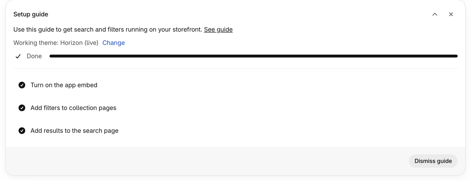
Three tasks that make search work on your storefront: turn on the app embed, add filters to collection pages (the Collection filters block) and add results to the search page (the Search results block). Each ticks itself off when the app finds it in your live theme, and a bar next to the progress line (for example 1 of 3 tasks complete) fills up as you go. The first task not done yet is open, with numbered steps and a button that takes you to the right place in the theme editor; click another task to open it instead. A finished task can be opened too: it says what's in place and keeps its button. See guide at the end of the description opens this guide.
Working theme under the description names the theme the guide is about, with Change to pick another (see Theme setup). While the app embed is off, a badge next to the progress says so. The arrow button folds the guide and the × button hides it; once every task is done, a Dismiss guide button also appears at the bottom.
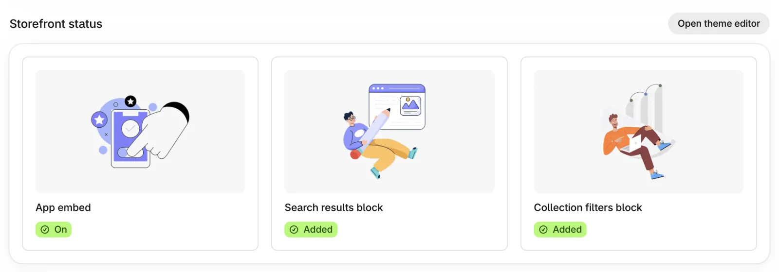
Once the guide is dismissed, the Storefront status card takes its place: it shows whether the app embed is on and whether the Search results and Collection filters blocks are added in your live theme, with a button to fix any that aren't. Show setup guide brings the guide back.
Last 7 days#
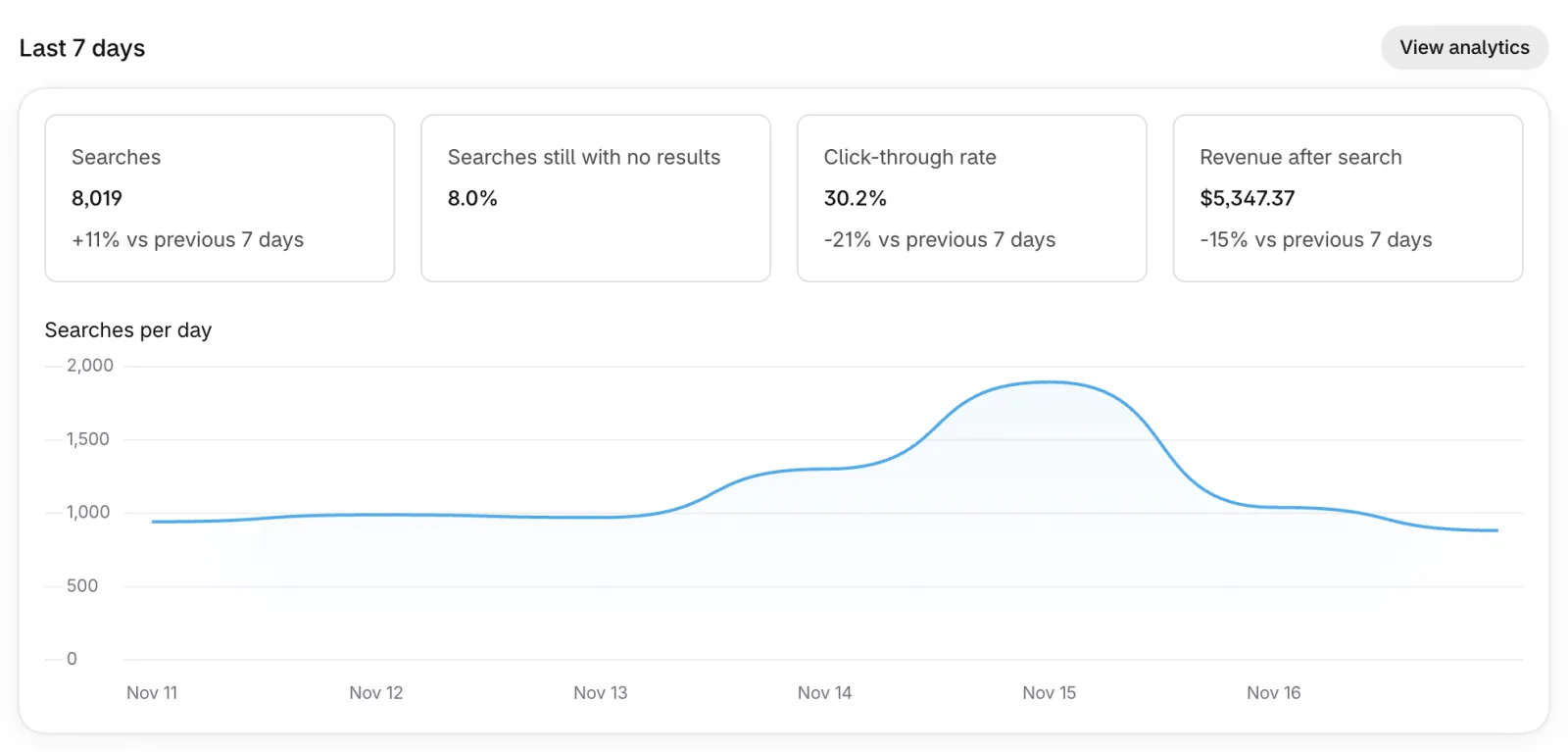
Each number is compared with the 7 days before. Days are counted in UTC.
Below the numbers, a chart shows searches per day, and two lists show the five most searched phrases and the five most searched phrases that found nothing. View all under each list opens the full report in Analytics → Search for the same days. A store with no searches yet sees one line instead; the chart and lists appear after the first searches.
| Option | What it does |
|---|---|
| Searches | Searches with a search term. |
| Searches still with no results | Share of searches that found no products. Searches that AI rewrote into words with results aren't counted. |
| Click-through rate | Product clicks after a search (results page or search dropdown) divided by searches. Clicks on collection pages aren't included. |
| Revenue after search | Order value within 30 minutes of a search. |
| Searches per day | Searches with a search term, for each of the 7 days. |
| Top search queries | The five phrases shoppers searched most, with how many times. |
| Top searches with no results | The five phrases that most often found no products. Add a synonym for them under Search & filters → Search → Synonyms, or a redirect under Search & filters → Merchandising → Redirects. |
If your catalog grows past your plan's product limit, a banner here explains what happens and which plan fits.
Search settings
Search & filters opens a page with two groups, Search and Browse. The Search pages are tabs in one row. General: settings that apply to both the search results page and the search dropdown (searchable fields and weights, languages, typo tolerance, ranking, query understanding, out-of-stock products, and a collapsed Advanced group with AI search and large catalogs). Search dropdown: see the next section. Search results: what to search on the results page. Synonyms and Stop words: see the end of this section. Try a search is on General and Search results. Changes apply right away without a re-sync; only data the app hasn't fetched yet is fetched in the background, and the message after saving says what is being fetched. Products left out of search on purpose are set under Settings → Catalog & sync (Exclude products).
Searchable fields and weights#
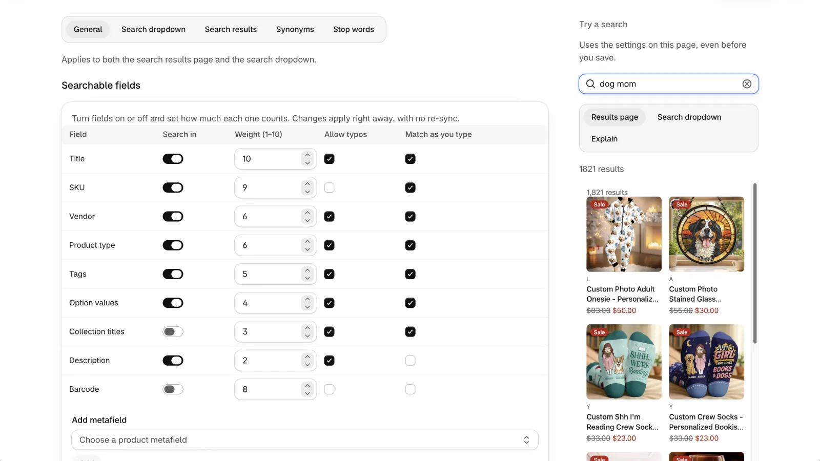
Each row is a product field. Turn it on or off, and give it a weight from 1 to 10: a match in a field with a higher weight ranks higher. Changes apply immediately, with no re-sync. Restore defaults at the top of the page puts every setting on the page back to its default (metafield rows stay, with default values); save to apply.
| Option | What it does |
|---|---|
| Search in | Whether this field is searched at all. |
| Weight (1–10) | How much a match in this field counts. |
| Allow typos | Whether a slightly misspelled word can still match this field. Usually off for codes like SKU and barcode. |
| Match as you type | Whether a partial word matches (“shi” finds “shirt”). |
Defaults: Title 10, SKU 9, Barcode 8 (off), Vendor 6, Product type 6, Tags 5, Option values 4 (sizes, colours and other variant options), Collection titles 3 (off), Description 2 (the first 1,000 characters are searched). SKU and Barcode also find part of a code: a piece between - _ / or . (“UGCG” finds SKU_UGCG/12oz and GT-Q011_UGCG/16oz), and, when nothing else matches, 3 or more characters from inside a code.
Search in metafields#
Add metafield lets you search a product metafield, for example a material or a model number. A new metafield row starts turned off, with weight 3, typos allowed and Match as you type off; Remove deletes the row. Removing a metafield applies right away. Adding one the app hasn't fetched yet starts a short background job when you save that fetches only that metafield (about 2 minutes); search keeps working meanwhile. Adding back a metafield the app already has needs nothing.
Typo tolerance#
| Option | What it does | Default |
|---|---|---|
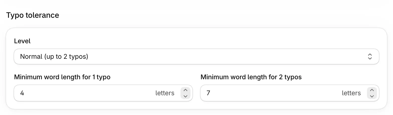
| Level | Off: exact spelling only. Low (1 typo): one wrong letter is accepted. Normal (up to 2 typos): two wrong letters in longer words. | Normal (up to 2 typos) |
| Minimum word length for 1 typo | Shorter words must be spelled exactly, so short searches stay precise. | 4 |
| Minimum word length for 2 typos | Words must be at least this long before two typos are accepted. | 7 |
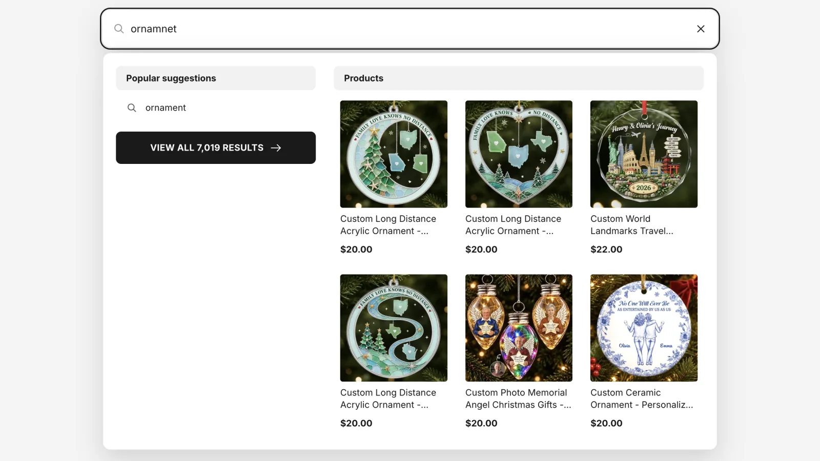
When results come from fixing a typo, the search results page says so: “Showing results for “ornament”. Search instead for “ornamnet””. The link searches the exact words typed, without fixing typos. Words with numbers (codes, sizes), synonyms and small words like “for” or “with” are never fixed. The texts are the same as for AI rewrites and can be changed under Appearance → Text & labels. The search dropdown puts the fixed word first in its keyword suggestions.
Ranking#
| Option | What it does | Default |
|---|---|---|
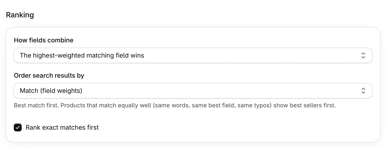
| Rank exact matches first | Products that match the search exactly come before typo or partial matches. | On |
| How fields combine | The highest-weighted matching field wins: weights decide the order. The best match wins; weight breaks ties: match quality first. Add up all matching fields: products matching in several fields rank higher. | The highest-weighted matching field wins |
| Order search results by | Applies to both the search results page and the search dropdown. Match (field weights): best match first, and products that match equally well (same words, same best field, same typos) show best sellers first. For searches of two or more words, products whose title has the words next to each other, in the same order (“dog mom” for “gift for dog mom”), come first; when one word is in most of your products (like “gift”), pairs without it count more. Small words such as for, the, with and of don't have to match and don't change the order. Best selling: every matching product is ordered by sales, however well it matches; products with no sales data come last. It applies when shoppers pick Relevance; the default sort is set under Search & filters → Sorting, and shoppers can pick another sort on the results page. | Match (field weights) |
Out-of-stock products#
| Option | What it does | Default |
|---|---|---|
| Show normally / Show at the end / Hide | Where sold-out products appear in search results and collection pages. | Show at the end |
What to search#
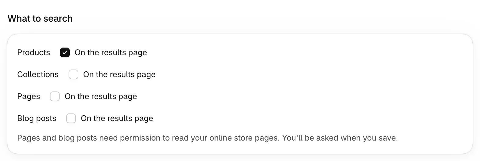
On the Search results tab, choose which content appears On the results page: Products, Collections, Pages and Blog posts. By default only products do. What appears in the instant search dropdown is set under Search dropdown.
Pages and blog posts are refreshed in the daily sync and when you save this page, not within a minute like products.
LanguagesPro plan and up#
Customers can search in your store's published languages: product titles, descriptions and tags are searched in their translations. On plans without this feature, search uses your main language; customers browsing in another language still get results.
AI searchPro plan and up#
Match by meaning also finds products whose words differ from the search, so “sneakers” finds running shoes. It works on the search results page and in the search dropdown, so both show the same products. Exact keyword matches still rank first. Turning it off applies right away. Turning it on rebuilds search from data already synced (a few minutes, nothing is downloaded from Shopify again); search keeps working while it runs. It's on the General tab, in the collapsed Advanced group.
| Option | What it does | Default |
|---|---|---|
| How closely results must match | Strict: only very close meanings. Balanced: recommended. Broad: also loosely related products. | Balanced (recommended) |
AI searchesBasic plan and up#
Each plan includes a number of AI searches every month (Basic 1,000 and Pro 5,000; the Free plan has none), shown under Settings → Subscription. When you need more, buy extra AI credits there: you pay once, they never expire and they're used after your monthly AI searches run out. When a search of any length finds nothing on the search results page, AI suggests up to three replacement searches in the words your catalog uses, most specific first (for example “Christmas pajamas”, then “pajamas”), and the page shows the first one that finds products without matching a large part of your catalog. If AI finds nothing your store sells, it suggests nothing. Shoppers see “Showing results for …” with a link to search their own words instead. Each real AI call uses one AI search, however many replacements it suggests and even when none of them finds anything. Reused answers (the same search again) and AI calls that fail or time out don't count.
AI is never used in the search dropdown, on collection pages, for redirected searches, when the shopper's chosen filters cause the empty result, or for searches that are too short (under 3 characters), have no letters, or look like an order number. If AI can't help, shoppers see your best sellers and popular searches (see When a search finds nothing).
The AI searches card under Search & filters → Search → General (in Query understanding) shows how many monthly AI searches you've used, how many your plan includes, the day they reset and your extra AI credits. Monthly AI searches start again at 0 every 30 days (on the Free plan, every calendar month); extra credits carry over and never expire. Changing plan in the middle of a cycle keeps the count: the new plan's number of AI searches applies right away. At 80% and at 100% of the monthly AI searches you get a notice in the app and one email; when extra credits run low and when they run out, you get one more of each.
When monthly AI searches run out, AI rescue keeps working with your extra credits. With none left, search keeps working: searches that find nothing show your fallback content until the next cycle. Buy extra AI credits (on the card, in the notices and under Settings → Subscription) opens a window where you slide to a credit pack, see the total you'll have after buying, and check out once on Shopify. Your subscription doesn't change.
Store profile: so AI knows your store's words, Kestrel has AI summarize your catalog once (product types, vendors, tags, collection names and some product titles; never customer or order data) into a short profile: what you sell and the words shoppers use for each product. It's built after a sync for catalogs with at least 20 products and up to 40 product types, and rebuilt only when your catalog changes a lot, at most once a week. Larger, more varied catalogs give AI their product type and vendor names instead, which works better for them. It doesn't use your AI searches. You can read it under Search → General → AI searches.
| Option | What it does | Default |
|---|---|---|
| Rescue searches with no results | Lets AI rewrite searches that find nothing. Applies only to the search results page. Uses your monthly AI searches first, then your extra AI credits. | On |
When a search finds nothing#
Shoppers never see an empty page. When a search still finds nothing, the search results page shows “No results for …” with up to 8 of your best sellers and up to 8 searches to click (your pinned suggestions first, then your most searched words, without hidden words and without misspelled words). The search dropdown shows a shorter version: 4 best sellers and 5 searches. Excluded tags and product types and hidden out-of-stock products stay out. Available on every plan.
When the shopper's chosen filters are what leaves no results, the page shows a Clear filters button instead of rewriting the search. Headings and button text are set under Appearance → Text & labels.
Before that, a search of three or more words that finds nothing as a whole is tried again without one word: first a word that isn't in any product title, type or brand, then the word found in the most products (for example “spaceship dog mom” shows “dog mom” products). This doesn't use AI searches.
Query understanding#
Turn words into filters reads searches like “red dress under $50” as the word “dress” plus the Red color and a price limit. Shoppers see a notice with a link to search their exact words instead. Available on every plan.
It works on the search results page and in the search dropdown (not on collection pages) and uses the Vendor, option and Price filters that are turned on for the search page. A price is used only when the shopper browses in your store's price currency. If the reading finds nothing, the plain search is shown.
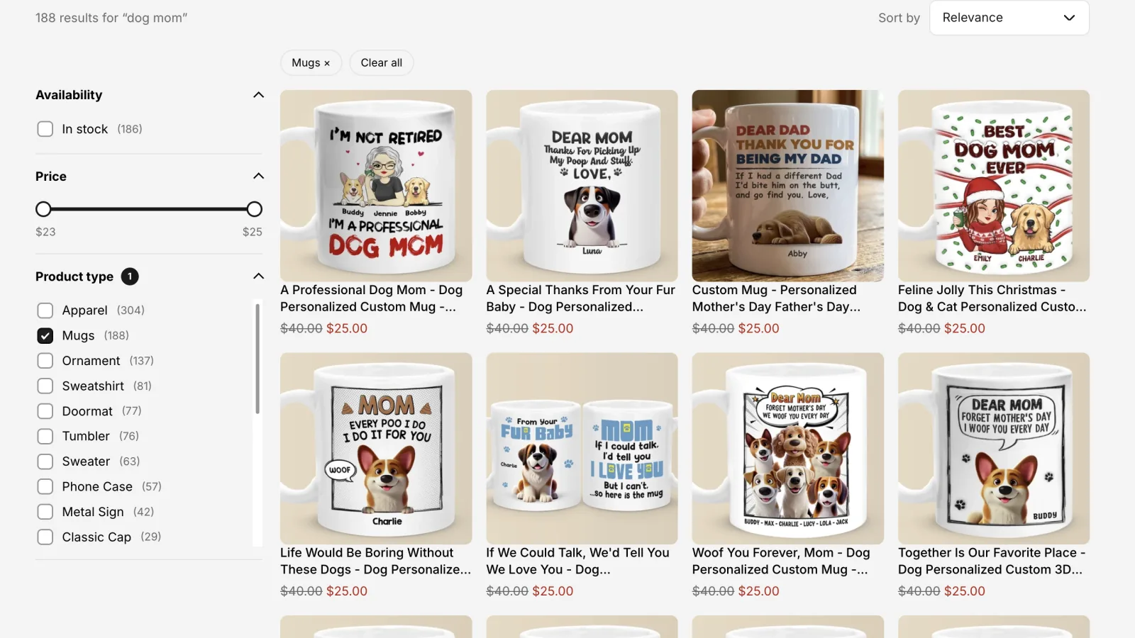
Words that are the name of a product type, in singular or plural, such as “ornament” when you sell the Ornament product type or “mug” when you sell Mugs, stay ordinary search words even if a filter has a value with the same name. So does a filter value found on only one or two products when that is under 1% of your catalog. This way a rare option value can't hide the products that match the word.
| Option | Default |
|---|---|
| Turn words into filters | Off |
Large catalogs#
Limit results to 10,000 items (General tab, in the collapsed Advanced group) caps each search at 10,000 products and estimates filter counts when a search matches more than that (the search engine samples 20% of the matches instead of counting them all). Search gets noticeably faster on catalogs with tens of thousands of products; shoppers rarely browse past the first few hundred results. Off by default. A search that matches more than 10,000 products shows “10,000+” on the results page and on View all in the search dropdown.
| Option | What it does | Default |
|---|---|---|
| Limit results to 10,000 items | At most 10,000 results per search; filter counts above that are estimates. | Off |
Try a search#
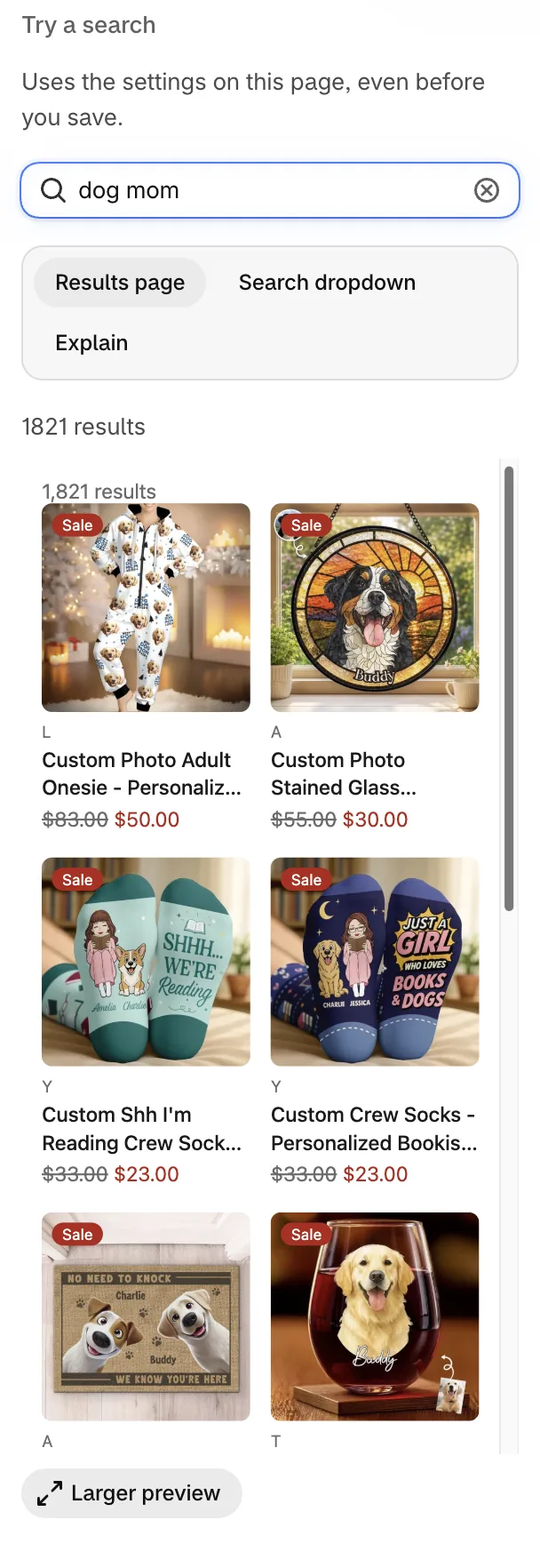
The panel on the right previews results with the settings on the page, even before you save. Switch between Results page, Search dropdown and Explain. Larger preview opens a full-width desktop view.
Explain has two parts. The How the app read this search box shows whether the search redirects, which words became filters (with Turn words into filters on), which synonyms it also searches, which words were ignored, the typo tolerance, the merchandising rules that apply and how results are ordered. Under each product is why it sits where it does: pinned or pushed up or down by which rule, which field matched (with its weight), which words and how (exact, start of word, close spelling, synonym), which products it ties with and whether best selling or newest breaks the tie, and that sold-out products go last. Arrows compare the ranking with your saved settings while you edit.
Synonyms#
| Option | What it does | Default |
|---|---|---|
| Two-way (all words mean the same) | Searching any of the words finds products with any of them (tee, t-shirt, tshirt). | — |
| One-way (a search term also finds other words) | When shoppers search for a word, Also show results for other words, but not the reverse (shoes → sneakers, boots). | — |
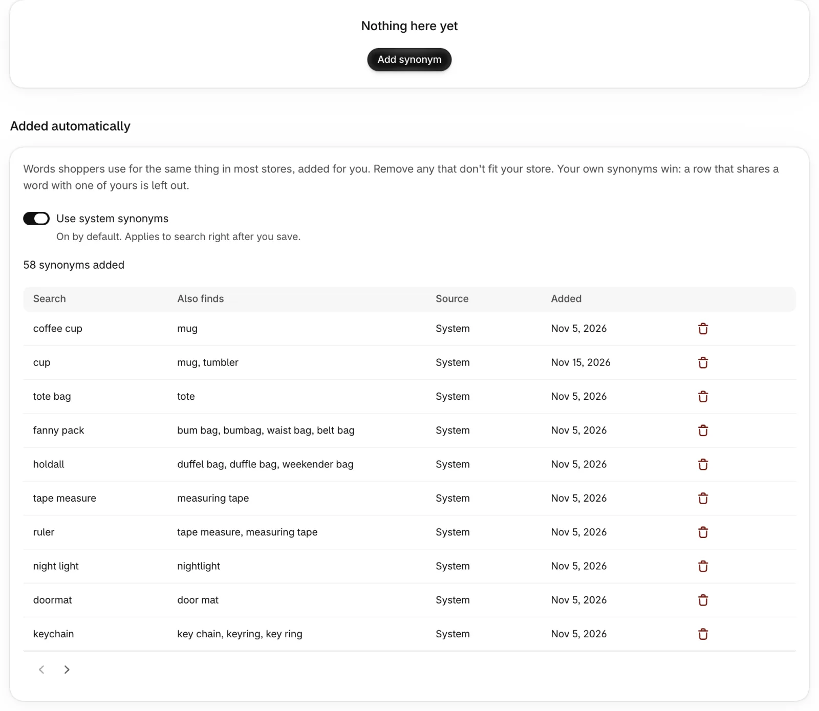
| Use system synonyms | Adds words shoppers use for the same thing in most stores: spellings (grey, gray), UK and US words (holdall, duffel bag) and everyday words (sweats → sweatpants, coffee cup → mug, cup → mug and tumbler). The Added automatically table lists them 10 per page with Search, Also finds, Source and the date each was added. Remove takes one out right away; Restore removed synonyms brings them all back. A row that shares a word with one of your synonyms shows Replaced by your synonym and is left out, so yours win. The switch is saved with the save bar. | On |
Searches with no results on the Analytics page have one-click Add synonym suggestions.
Stop words#
Words ignored in searches, such as “the” or “and”, per language. Useful when filler words keep searches from matching.
Search dropdown
How the instant search dropdown behaves, in the order shoppers see it: when it opens, the keyword suggestions and which results it shows. Settings on the General tab (fields, typos, ranking, query understanding) apply to it too. How it looks (layout, number of products and keyword suggestions per device, price and vendor) is set under Appearance → Search dropdown layout.
Before the shopper types#
With Open the dropdown before the shopper types on, the dropdown opens as soon as a shopper clicks into the empty search box, with keyword suggestions (pinned first, then your most searched words) and what you choose under What to show: Best sellers (your best-selling ranking; newest products while the store has no sales data), A collection (that collection's own order) or A message asking the shopper to type (no products; the dropdown opens with the message even when there are no keyword suggestions yet). The message text is set under Appearance → Text & labels.
Excluded and hidden sold-out products never appear. With best sellers or a collection and nothing to show, the dropdown stays closed. When the shopper types a first letter the dropdown stays as it is; from the second letter it shows results for the words typed. If the chosen collection is deleted or empty, the dropdown shows keyword suggestions only and this page warns you.

| Option | What it does | Default |
|---|---|---|
| Open the dropdown before the shopper types | Open the dropdown on a click into the empty search box. | Off |
| What to show | Best sellers, A collection or A message asking the shopper to type. | Best sellers |
Keyword suggestions#
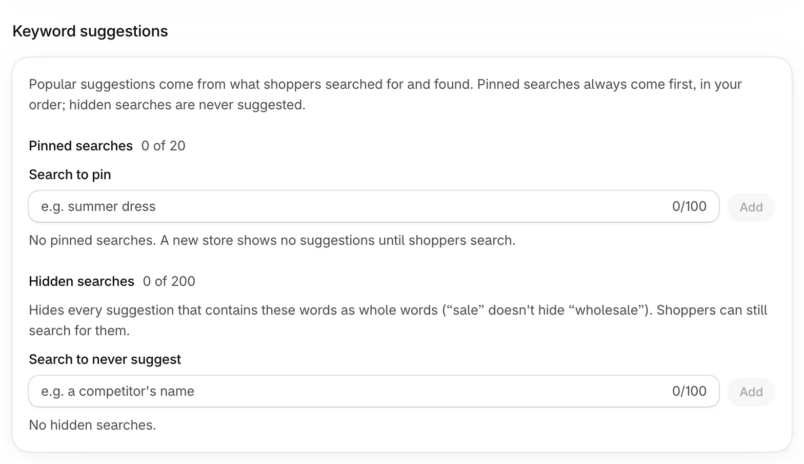
Popular suggestions come from what shoppers searched for and found; when the app fixed a typo, the fixed word is counted, and a suggestion with a word that isn't in your product titles, types or brands (a misspelling) is never shown, unless you pinned it. When pinned and popular suggestions aren't enough, words from your product titles, types and brands that start with what the shopper typed fill the list, the word in the most products first (“grand” → grandma, grandpa, grandkids); common English words like “much” are skipped. Pinned searches (up to 20) always come first, in the order you set by dragging the handle, and match what the shopper types the same way popular ones do; a new store with no searches yet still has suggestions. Hidden searches (up to 200) are never suggested: a suggestion is hidden when it contains a hidden search as whole words, ignoring upper/lower case and accents, so hiding “competitor x” also hides “competitor x shoes”, and hiding “sale” doesn't hide “wholesale”. Shoppers can still search for hidden words.
A search can't be both pinned and hidden: saving shows Already pinned next to it. Pinned and hidden searches work on every plan and in every store language.
| Option | What it does | Default |
|---|---|---|
| Pinned searches | Searches always suggested first, in your order. | None |
| Hidden searches | Searches never suggested. | None |
What to show in the dropdown#
Choose which results appear in the dropdown: Products, Collections, Pages and Blog posts (by default products, collections and pages). Whether products show the price and the vendor is set under Appearance → Search dropdown layout. Headings and other text in the dropdown are set under Appearance → Text & labels.
Sorting
Choose which sort options shoppers see, in what order and under which names, and which sort each page opens with.
Sort options#
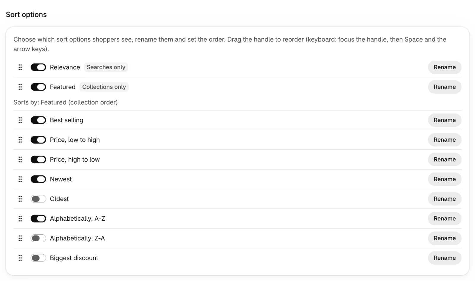
Turn each option on or off, and drag the handle at the start of a row to reorder. With a keyboard: Tab to the handle, press Space or Enter to pick the row up, move it with the arrow keys and press Space or Enter again to drop it (Escape cancels). Rename changes the name shoppers see, with an optional translation per store language.
Badges explain where an option appears: Searches only (Relevance) or Collections only (Featured). Needs sales data means the app doesn't have your best-selling order yet. It reads it right after your catalog syncs; until then shoppers don't see Best selling in the Sort by menu. Oldest, Alphabetically Z–A and Biggest discount are off by default.
| Option | What it does |
|---|---|
| Relevance | Best match for the search. Search pages only. |
| Featured (collection order) | The collection's order in Shopify: the order you set by hand, or Shopify's Most relevant order. Collection pages only. |
| Best selling | Most sold first (see Best-selling ranking). |
| Price, low to high / Price, high to low | By price. |
| Newest / Oldest | By the date the product was published to your store (the creation date if it has none). |
| Alphabetically, A–Z / Z–A | By product title. |
| Biggest discount | Largest percentage off the compare-at price first. |
Add a metafield sort#
Number, rating and date metafields can be used as a sort option (for example, by rating). Choose the metafield and the Direction (High to low by default, or Low to high), then Add. A metafield sort can be renamed like any other option, and Remove deletes it. Removing one applies right away; adding one the app hasn't fetched yet fetches only that metafield after you save.
Default sort and collection overrides#
| Option | What it does | Default |
|---|---|---|
| Search results page | The sort used when a search opens. | Relevance |
| Collection pages | The sort used on collection pages, or Use each collection's sort order from Shopify. | Each collection's sort order from Shopify |
| Collection overrides | A different default sort for specific collections. Add collections to choose them; each starts with Featured. | — |
How products are ordered when shoppers search a keyword and pick Relevance is set under Search & filters → Search → General → Ranking (Order search results by). Merchandising rules (pin, hide, boost and bury) apply with every sort the shopper picks, not only Relevance. Without a keyword, products that tie on the chosen sort show best sellers first. A block's own Default sort setting in the theme editor wins over these when it isn't set to App setting, as long as that sort option is turned on here.
Best-selling ranking#
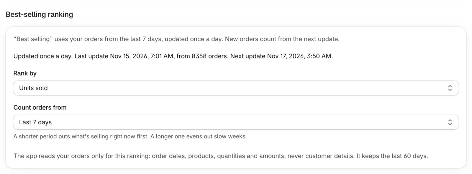
Best selling ranks products by your recent orders and updates once a day: new orders count from the next daily sync (at the hour set under Settings → Catalog & sync), so the order on your storefront does not change right after a sale. Sorting → Best-selling ranking shows the last update, how many new orders are waiting and when the next update runs, in your store's time zone. The app asks for permission to read orders when you install it, imports the last 60 days once your catalog has synced, and turns this on by itself: there's nothing to switch on. Until the import finishes, Best selling follows Shopify's own ranking. If you granted the permission after installing, the app switches to your orders within 15 minutes.
Shopify shares its own ranking for the first 25,000 products only. Products past that, and products with no orders in the chosen days, come after the products that sold, newest first. The Sorting page shows when the ranking was last updated, how many products have sales data and, if the last update failed, why.
How many days of orders count is set right below Rank by (see Orders for best-selling). The app only uses order dates, products, quantities and amounts, never customer details, keeps the last 60 days and deletes them when you uninstall the app.
| Option | What it does | Default |
|---|---|---|
| Rank by | Units sold, Number of orders or Sales amount. | Units sold |
Orders for best-selling#
Best selling ranks products by your orders from the period you choose here, next to Rank by, and saved with the same save bar. A shorter period puts what's selling right now first. A longer one evens out slow weeks. Settings → Catalog & sync shows the period in use, with a link here.
The app keeps 60 days of orders, so changing this only recalculates the ranking, without importing orders again.
| Option | What it does | Default |
|---|---|---|
| Count orders from | Last 7 days, Last 14 days, Last 30 days or Last 60 days. | Last 7 days |
Filters
Build the filters shoppers use on collection and search pages: which ones appear, in what order and how they look.
Default, search page and collection overrides#
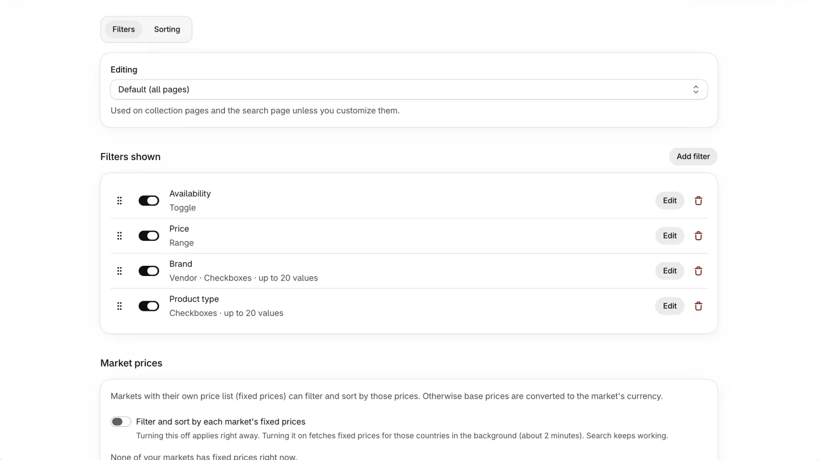
The Editing menu at the top chooses which set of filters you're changing.
| Option | What it does |
|---|---|
| Default (all pages) | Used on collection pages and the search page unless you customize them. |
| Search page | Uses the default filters until you choose Customize for search; Use default filters goes back. |
| Collection override | Add collection override gives one collection its own filters; other collections keep the default. Remove override goes back to the default. |
Filters shown#
The default filters are Availability, Price, Brand (vendor) and Product type. Each filter has a switch to show or hide it, Edit and a delete button. Drag the handle at the start of a row to change the order shoppers see (keyboard works the same as in Search & filters → Sorting). Changes are saved with the save bar at the top; removing a metafield filter applies right away, and adding one the app hasn't fetched yet fetches only that metafield after you save.
Add or edit a filter#
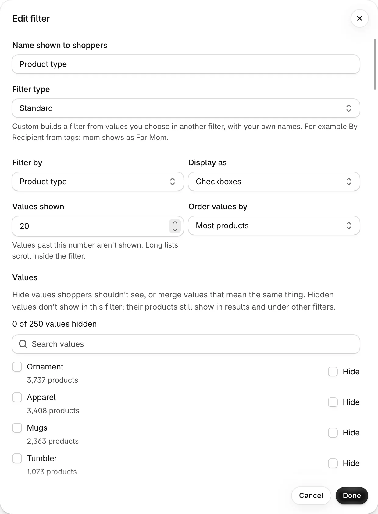
Some options only appear for some styles: Values shown and Order values by for list styles (checkboxes, single choice, swatches), Show product counts for everything except Range, and Products must match all selected values for checkboxes and swatches. List styles also get Values, where you can hide or merge values.
| Option | What it does | Default |
|---|---|---|
| Filter type | Standard filters by a field of your products. Custom shows values you choose from another filter, under your own names. See Custom filters. | Standard |
| Filter by | Vendor, Product type, Tag, Collection, Price, Availability, On sale, Variant option (like Size or Color) or Metafield. | — |
| Display as | Checkboxes (several values), Single choice, Color swatches (variant options, tags and metafields), Range (a slider, for price and number or rating metafields) or Toggle (for availability and on sale). Only the styles that fit the source are offered. | — |
| Name shown to shoppers | Used in every language unless you add a translation under Translations. | — |
| Option name | For variant options: the option as written in Shopify, for example Size or Color. | — |
| Metafield | For metafield filters: the product metafield to use. | — |
| Only tags starting with | For tag filters: only tags with this prefix, shown without it (prefix color: shows color:Red as Red). | — |
| Collapsed by default | Starts closed on desktop. | Off |
| Show product counts | Shows how many products have each value. | On |
| Values shown | The most values the filter lists (1–250); values past this number aren't shown. Long lists scroll inside the filter. | 20 |
| Order values by | Most products or Alphabetical. | Most products |
| Products must match all selected values | Off: products with any selected value. On: products with every selected value. | Off |
Hide or merge values#
In Edit for a list-style filter, Values lists the real values in your catalog with how many products have each, most products first (up to 250; type in Search values to find one). Changes go into the filter and are saved with the save bar.
Merged values show as one value with the products of all of them added up. The first value you ticked is the one used in the page address, so links keep working if search is ever unavailable.
| Option | What it does |
|---|---|
| Hide | The value doesn't show in this filter. Its products still show in results and under other filters. A value a shopper already chose (from a link) stays visible so they can clear it. |
| Merge | Tick two or more values that mean the same (Navy, Navy blue), enter a Merged value name and press Merge. Choosing the merged value finds products with any of them. Unmerge splits them again. |
Custom filters#
A custom filter shows values you choose from another filter, under names you pick, like a gift store's By Recipient built from tags: mom shows as For Mom, and pet and pet lovers both show as For Pet Lover. In Add filter, set Filter type to Custom, pick the Parent filter (tags, vendor, product type, a variant option or a metafield) and choose the values.
You can add several custom filters from the same parent, for example By Recipient and By Occasion from tags. Each value belongs to the filter that lists it, so choosing For Mom doesn't tick anything in By Occasion. The page address still uses the parent's value (mom), so links keep working if search is ever unavailable.
Add parent filter combines up to five parents in one filter, for example tags and product type: the tag mom and the product type Mother's Day can both show as For Mom. Each value in the table shows which parent it comes from. A filter with several parents has its own page address that Shopify's own filters don't understand, so if search is ever unavailable the theme shows products without that filter.
| Option | What it does | Default |
|---|---|---|
| Use certain filter values | Only the values you tick show, under their Display name. New values in your catalog don't appear until you add them. | On |
| Use all parent filter values | Every value of the parent shows; give a value a Display name to rename it. | — |
| Display name | What shoppers see. Empty uses the value itself. Values with the same display name show as one value, with their products added up. | — |
| Add a value that isn't in your catalog yet | Adds a value no product has yet, for example a tag you're about to use. It shows once products have it. | — |
| Keep parent filter | When adding a custom filter: on keeps the parent filter (for example Tags) in the list, off removes it. | On |
| Add parent filter | Adds another parent (up to five). The bin button next to a parent removes it with its values. | — |
| Import | Reads a CSV file with the columns Value and Display name (with several parents, also Parent filter: tags, vendor, product_type, opt_ + option name, or mf_ + metafield). Imported values are added to the list; a value already there takes the imported display name. | — |
| Export | Downloads the values as a CSV file in the same format, ready to edit in a spreadsheet and import again. | — |
Market prices#
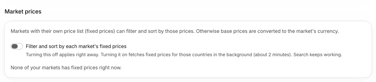
Markets with their own price list (fixed prices) can filter and sort by those prices. Otherwise base prices are converted to the market's currency. Filter and sort by each market's fixed prices applies right away (no save bar). Turning it off needs nothing else; turning it on fetches the fixed prices of those countries in the background (about 2 minutes); search keeps working while it runs.
Prices shoppers see always come from Shopify for their market. If a price can't be confirmed, the product shows a price placeholder instead of a wrong amount.
Merchandising
Shape what shoppers find with Rules that pin, hide, boost or bury products in search results and on collection pages, and Redirects that send a search keyword straight to a page. Both are in the Merchandising group of the Search & filters page. Changes reach the storefront right away. Synonyms and stop words help the app understand searches, so they are under Search & filters → Search (Synonyms, Stop words).
Redirects#
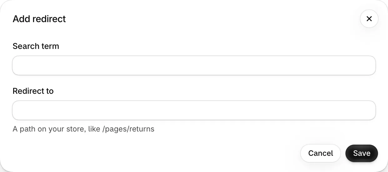
Send a search straight to a page instead of results, for example returns → /pages/returns. Redirect to is a path on your store.
Rules: pin, hide, boost and buryBasic plan and up#
A rule changes results for one search or one collection. Pin, hide, boost and bury apply with every sort the shopper picks, not only Relevance. On plans without merchandising, existing rules are kept but don't change results; they can be deleted but not added or edited.
For a search rule, Try a search in the rule form shows the top results with this rule and without any rule, before you save; badges mark products the rule added or moved. Nothing changes on your store until you save.
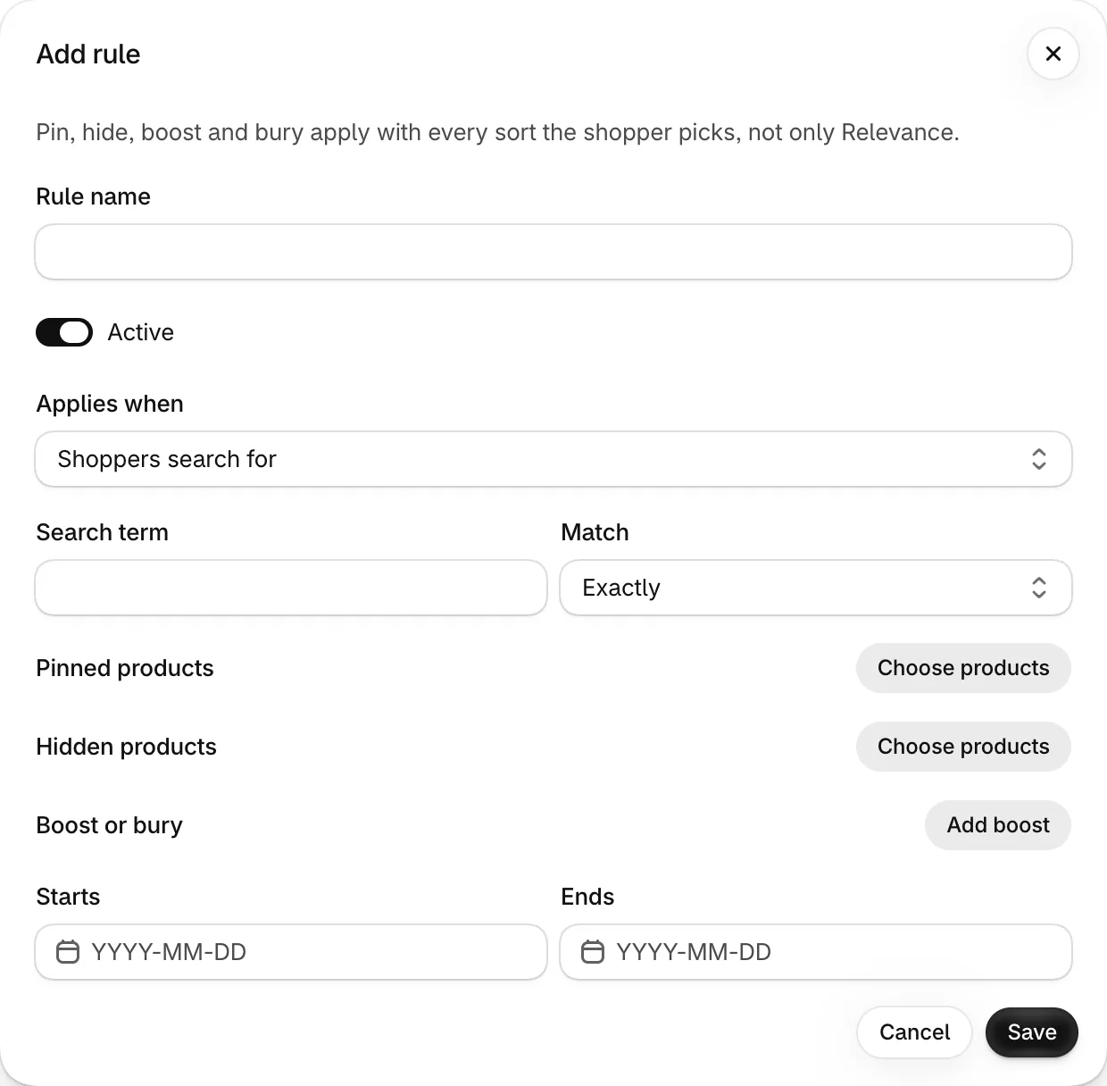
| Option | What it does | Default |
|---|---|---|
| Rule name | A name to find the rule in the list. | — |
| Applies when | Shoppers search for a term (Exactly or Contains; Exactly by default) or Shoppers view a collection. | — |
| Pinned products | Products placed at a fixed Position (1–250) in the results. | — |
| Hidden products | Products removed from these results. | — |
| Boost or bury | Move products with a value up or down: Field (Vendor, Product type, Tags or Collection), Value and Weight from −10 (bury) to 10 (boost). | — |
| Starts / Ends | Optional dates, for sales and seasonal campaigns. | — |
| Active | Turn a rule off without deleting it. | On |
Appearance
Match the search box, results and filters to your brand. The page has groups: Global style, Product cards, Search dropdown layout, Text & labels and Advanced. One save bar saves them all, and switching groups keeps unsaved changes. The preview next to the form shows your changes on sample products before you save. Advanced has a Custom CSS button that opens Settings → Custom code on the CSS tab, where your CSS is edited and saved.
Global style#
Restore defaults puts every style value back to the defaults below.
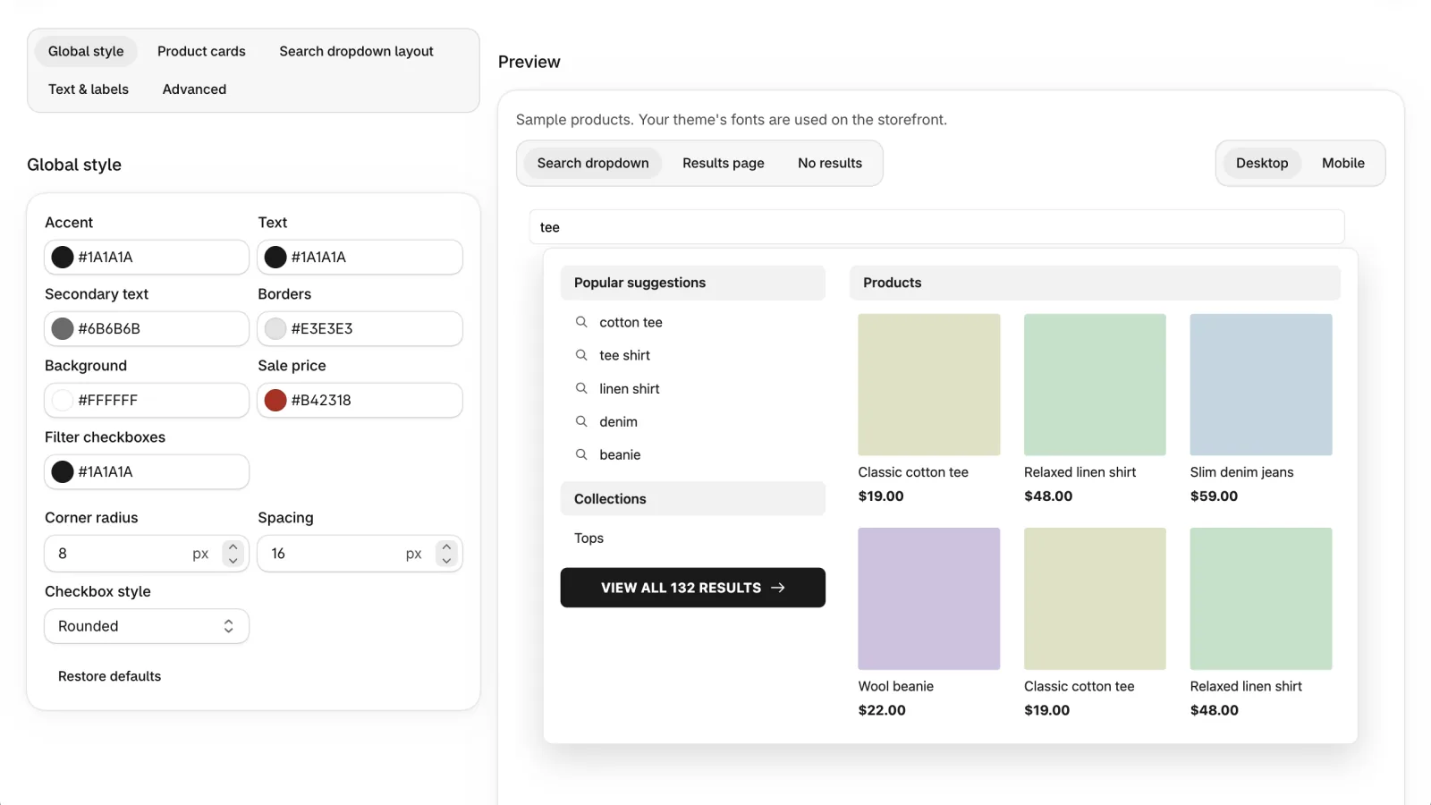
| Option | What it does | Default |
|---|---|---|
| Accent | Buttons, selected filters and links. | #1A1A1A |
| Text | Main text color of the dropdown, filters and product cards. | #1A1A1A |
| Secondary text | Result counts, the Sort by label, filter counts, vendors and crossed-out prices. | #6B6B6B |
| Borders | Lines around inputs, menus and filters. | #E3E3E3 |
| Background | Background of the dropdown and panels. | #FFFFFF |
| Sale price | The discounted price and the Sale badge. | #B42318 |
| Filter checkboxes | Fill of a ticked filter checkbox. The tick turns dark on light colors and white on dark ones. | #1A1A1A |
| Corner radius | Roundness of inputs, cards and buttons (0–24 px). | 8 |
| Spacing | Space between products and elements (4–48 px). | 16 |
| Checkbox style | Shape of the filter checkboxes: Square, Rounded or Circle. | Rounded |
Product cards#
Under Show on your storefront, choose what shoppers see on product cards (search results and collection pages), and whether they have an Add to cart button. What products in the search dropdown show is set under Search dropdown layout. The preview switches to the part you change. Templates a theme developer adds to the theme get the same data, so they follow these choices too (see the developer docs).
| Option | What it does | Default |
|---|---|---|
| Vendor | The brand above the product title on product cards. | On |
| Product type | The product type under the title on product cards. | Off |
| Compare-at price (crossed out) | The original price, crossed out, next to a lower price on product cards. | On |
| Sale badge | The Sale label on discounted products. | On |
| Sold out badge | The Sold out label on products that can't be bought. | On |
| Add to cart button Pro plan and up | A button under each product card that adds the product to the cart without leaving the page, then shows View cart. Products with several variants link to the product page unless the variant picker is on. | Off |
| Variant picker (products with several variants) Pro plan and up | A list of the product's variants next to the button; sold-out variants can't be picked. Needs Add to cart button. | Off |
| Variant picker style Pro plan and up | How the variant picker looks: Dropdown (one list of variants), Buttons (a row of buttons for each option, such as Size and Color) or Color swatches (color swatches for colors, buttons for the other options). A swatch uses the color you set for the option value in Shopify, or the color's name when the option is called Color and the value is a plain color name like Red. Values that are sold out with the current choice are crossed out. An option with one value is not shown, and one with more than 12 values is shown as a small list. Products that haven't been synced since this option was added keep the dropdown until their next update; run a full sync under Settings → Catalog & sync to switch them all at once. Shown when Variant picker is on. | Dropdown |
| Add to cart and variant picker style Pro plan and up | A section that appears when Add to cart button is on. Colors for the Add to cart button (background, text) and for the variant picker (border, background and text, and the same three for the selected variant), Variant button size (Small, Medium or Large), Variant corner radius (0 to 24 px), Swatch size (20 to 40 px) and Swatch shape (Circle or Square). Leave a field empty to follow the colors and corner radius of Style. When you set a background without a text color, the text is black or white, whichever reads better. The preview shows the change right away. | Empty (follows Style) |
Theme developers can update the theme's cart count or open its cart drawer when a product is added: the app sends a searchapp:cart-add event (see the developer docs). Without theme access, use Custom code.
Search dropdown layout#
How the instant search dropdown looks. Desktop shows two columns: keyword suggestions on one side, products on the other. Phones show keyword suggestions, then products, then a View all button. Choose whether products show the Price and the Vendor, and for each device how many products and keyword suggestions show (fewer appear when there aren't enough results) and whether products show as a Grid or a List of rows (a small image, the name and the price). The preview shows the dropdown with your unsaved changes. What the dropdown shows before and while the shopper types is set under Search & filters → Search dropdown.
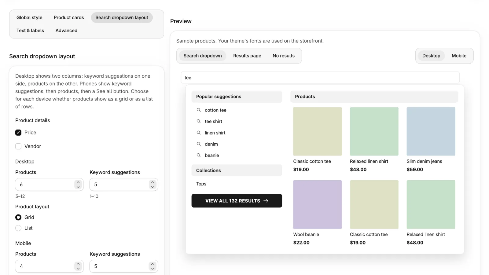
| Option | What it does | Default |
|---|---|---|
| Price | Show the price on products in the dropdown. | On |
| Vendor | Show the vendor on products in the dropdown. | Off |
| Products | Products in the dropdown: desktop 3–12, mobile 2–8. | Desktop 6, mobile 4 |
| Keyword suggestions | Keyword suggestions (pinned and popular): 1–10 on each device. | 5 |
| Product layout | Grid or List, for desktop and mobile separately. | Desktop Grid, mobile List |
Text & labels#
Change the words shoppers see, for English and up to three more store languages: the search box placeholder (when set, it replaces your theme's; empty keeps your theme's), the headings in the search dropdown (suggestions, products, collections, pages), the View all link, the no-results title and hint, the filters heading, Clear all, the In stock filter label, the Show products and Reset filters buttons of the mobile filter panel, the sort label, the result count (with its own wording for a single result, and for the search page, where {q} names the search), how a count over the limit is written ({n}+ by default, as in “10,000+”), Previous and Next page links, the Show more button (when the block's Pagination is not numbered pages), the Sold out and Sale badges, the price placeholder, the notice shown when a search is turned into filters, the notice and link shown when AI rewrites a search ({q} is the new search, {original} what the shopper typed), and the headings and Clear filters button shown when a search finds nothing. Leave a field empty to use the default. Placeholders like {q} (the search) and {n} (a count) are filled in for you.
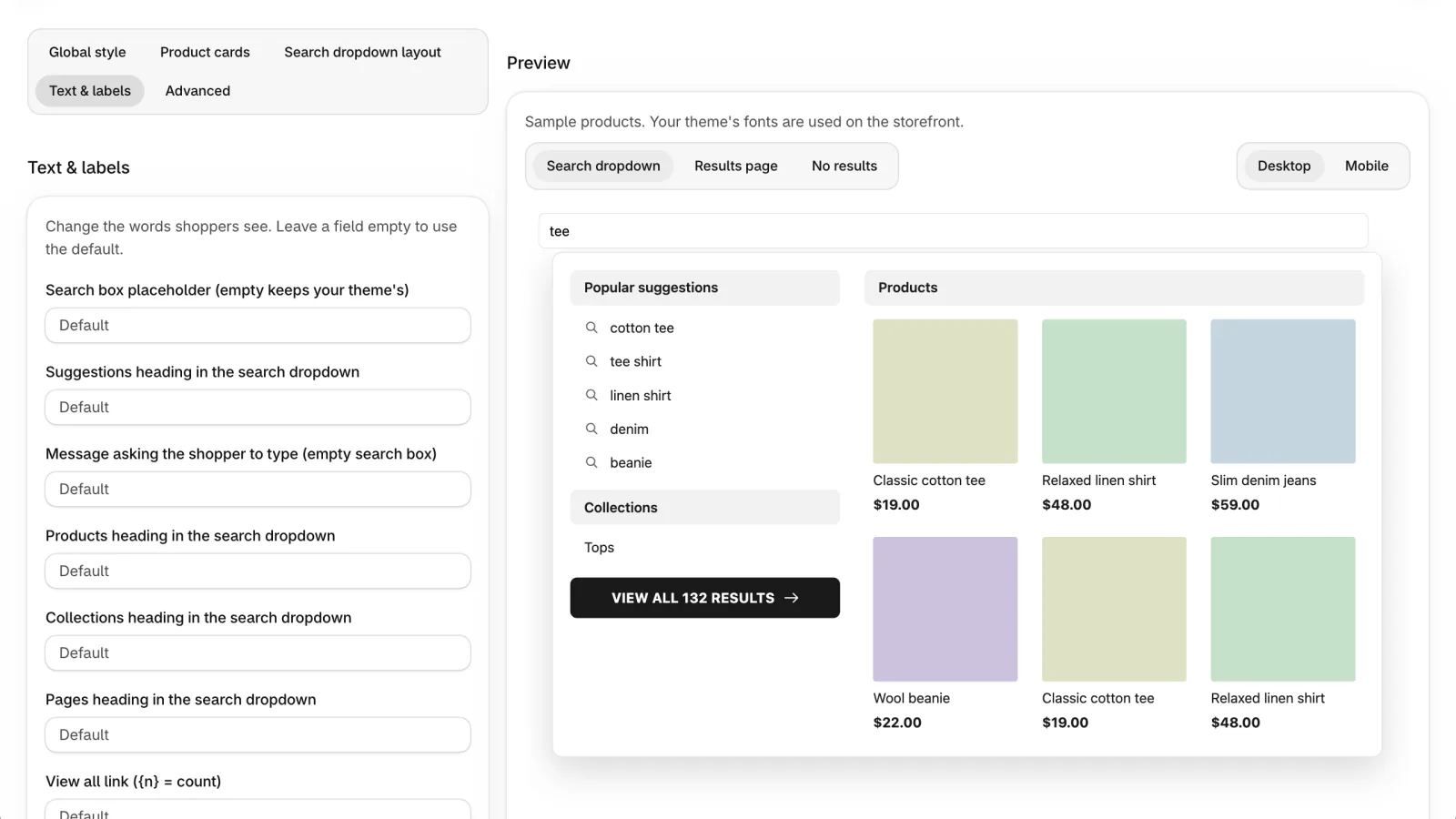
Preview#
Switch between the Search dropdown, the Results page and No results, on Desktop or Mobile. No results also shows what shoppers see when a search finds nothing: sample popular searches and best sellers under your headings. The preview uses the same styles and built-in templates as your storefront; your theme's fonts are used on the real store. Larger preview opens a full-width view.
Analytics
See what shoppers search for, what they click and buy afterwards, and which searches find nothing.
Overview#
Pick a date range: Today, Yesterday, Last 7, 30 or 90 days (Last 30 days by default), This month, Last month or your own dates. The Export button next to the date range downloads reports (see Export). Days are counted in UTC. How far back you can look depends on your plan (see Plans and billing); data is collected every day either way.
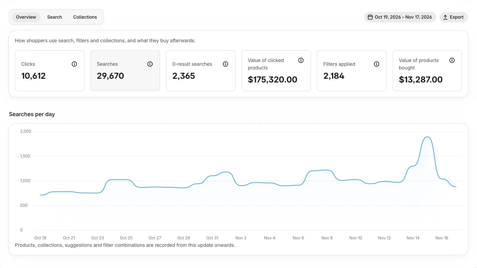
| Option | What it does |
|---|---|
| Clicks | Product clicks from search results, collection pages and the search dropdown. |
| Searches | Searches with a search term. |
| 0-result searches | Searches that found no products. |
| Value of clicked products | Clicks multiplied by each product's current price. |
| Filters applied | Times shoppers selected a filter value. |
| Value of products bought | Order value within 30 minutes of a search or collection visit. |
Search and Collections reports#
Search has tabs for Queries, 0 results, Suggestions, Product performance, Filters, Filter values, Filter value combinations and Sorting. Collections shows views, clicks and purchases per collection and how shoppers filter them. Each table can be searched and sorted.
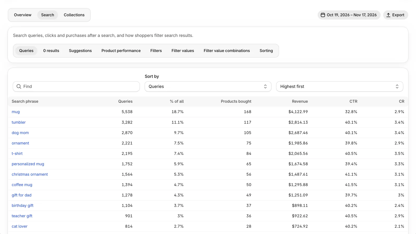
| Option | What it does |
|---|---|
| Rescued by AI Basic plan and up | On the 0 results tab: searches that found nothing as typed and that AI rewrote into words with results. |
| AI searched for Basic plan and up | On the 0 results tab: the latest words AI searched for instead. |
| CTR | Share of searches followed by a product click. |
| CR | Share of searches (or collection views) followed by an order. |
One search in detail#
On the Queries and 0 results tabs, click a search to open its page: searches, searches that found nothing, clicks, click rate, add to carts, orders and revenue, each compared with the same number of days just before, plus searches per day split into found products and found nothing.
Click rate shows once a search has 10 searches in the dates you picked; before that you see the counts so far, so a few searches can't make a number look better or worse than it is.
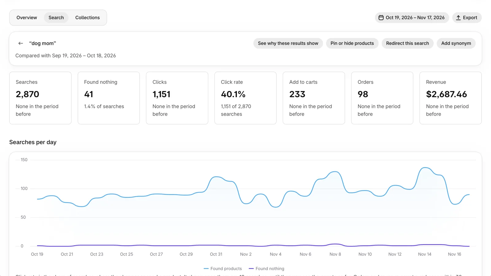
| Option | What it does |
|---|---|
| See why these results show | Opens Try a search under Search & filters → Search → General with this search already typed, in the Explain view, so you see how the app read the search and why each product shows where it does. |
| Pin or hide products | Starts a merchandising rule for this exact search. |
| Redirect this search | Sends shoppers who search this to a page you choose. If a redirect exists, Edit redirect opens it. |
| Add synonym | Adds a synonym that starts from this search. |
Searches with no results and suggested synonyms#
For searches that found nothing, Add synonym or Add redirect in one click. Suggested synonyms lists no-result searches that look like words in your catalog (missing accents, spacing or hyphen, singular or plural, spelling); approve to make the search find those products.
Export#
The Export button next to the date range opens a window where you download any report for the selected dates as a CSV file.
Shopify Analytics#
At the bottom of Analytics → Overview, the app can also send Shopify an event for each search counted on your results page and for each order that came from a search or a collection page (only for shoppers who allow analytics). No search text or shopper details are sent. You then see the numbers by app in Shopify's own Analytics → Reports.
Copy one of the two queries shown, then in Analytics → Reports create an exploration and paste it into the ShopifyQL editor. Shopify keeps these events for 30 days; the app's Analytics keeps the full history.
| Option | What it does | Default |
|---|---|---|
| Report search activity to Shopify Analytics | Turns sending on or off. Saved with the save bar; events go out within a few minutes. The card shows how many search events and orders Shopify accepted in the last 7 days. Order totals are included only for stores that sell in USD; other stores send the order count. | Off |
Catalog & sync
What the search index is, how it stays up to date on its own, when to use each button, and which products to leave out of search on purpose (by tag or product type). The page also shows how many days of orders Best selling counts, with a link to change it under Search & filters → Sorting.
What the search index is#
To answer in a few milliseconds, Kestrel doesn't ask Shopify each time a shopper types. It keeps its own copy of your catalog, called the search index: products, variants, collections, tags, product types, metafields you filter by, pages and blog posts, and your recent orders for Best selling. Search, filters, sorting and the instant search dropdown all read from this copy.
Prices shoppers see always come live from Shopify, in their market's currency and with the right discounts. The index keeps only the base price, which it uses to filter and sort by price.
Syncing means keeping this copy the same as your store. You don't have to do anything for that: the app does it on its own, in the layers below.
How syncing works#
Within about a minute: when you add, edit, hide or delete a product, change a price or inventory, or change a collection, Shopify tells the app and that product is updated in search.
Every 5 minutes: the app asks Shopify for anything changed since the last check, in case a notification was late or lost.
Once a day, at the hour you choose: the daily sync compares every product in search with Shopify and fixes what differs, refreshes pages and blog posts, updates the Best selling ranking, and picks up new markets and languages. See Daily sync.
A full sync reads your whole catalog again and builds a new index. It runs on its own when you install the app, when a new language is added (by a plan change or in Shopify), when the store's currency changes, when your plan's product limit changes what is in search, or when the daily sync finds that many products differ (more than 2%). Search keeps working on the current data until the new index is ready, so shoppers never see an empty search.
Search settings don't need a sync: weights, synonyms, filters, sorting and merchandising apply right away. Data the app hasn't fetched yet (a new metafield, fixed market prices, products of a tag you no longer skip) is fetched on its own in the background.
The status card shows progress step by step: Products, Variants and prices, Collections, Save to the search index, Switch search to the new data. While it runs, the card says when it started and shows Taking longer than usual if it has run 50% longer than the last sync of the same kind. A large catalog (tens of thousands of products) can take up to an hour.
A paid-plan store with no searches for 30 days has its search index paused to save resources. It rebuilds automatically on the next search (the theme shows its own results until then) or when you open the app. Free-plan stores are never paused.
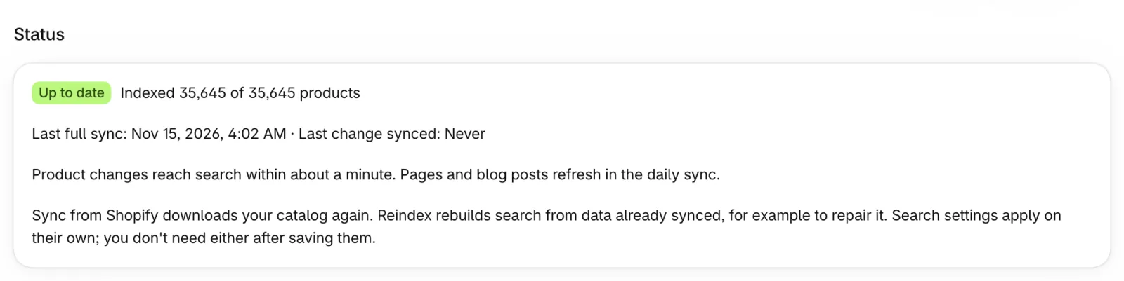
| Option | What it does |
|---|---|
| Sync from Shopify | Reads all products, variants and collections from Shopify again. Use it if a change still isn't in search after 10 minutes, for example after a bulk import. |
| Reindex | Rebuilds the search index from data already synced, without contacting Shopify. Faster than a sync. Use it if results look wrong but your products in Shopify are right. It doesn't pick up new products. If your catalog is over your plan's product limit, it keeps only the products your plan allows, like a full sync. |
You rarely need either button: changes reach search on their own within minutes, and the daily sync fixes anything that was missed.
Daily sync#
Once a day the app checks search against Shopify product by product and fixes any difference, refreshes pages and blog posts, updates the Best selling ranking, and picks up new markets and languages. If many products differ (more than 2%), it runs a full sync instead. Search keeps working while it runs. It is always on: there is nothing to switch on.
Pick an hour when few shoppers visit, in the time zone that suits you: your store's time zone (the one set in Shopify Settings → General) by default, or another one, for example where most of your shoppers live. Each store starts at its own minute within that hour, the same every day, and the page shows when the next one starts.
If a full sync is running at that time, the daily sync waits for it to finish. If the app was down at that time, it catches up within 6 hours. It runs at most once a day, so moving the hour later on a day it already ran waits until the next day. Each run is listed as Daily check in the history.
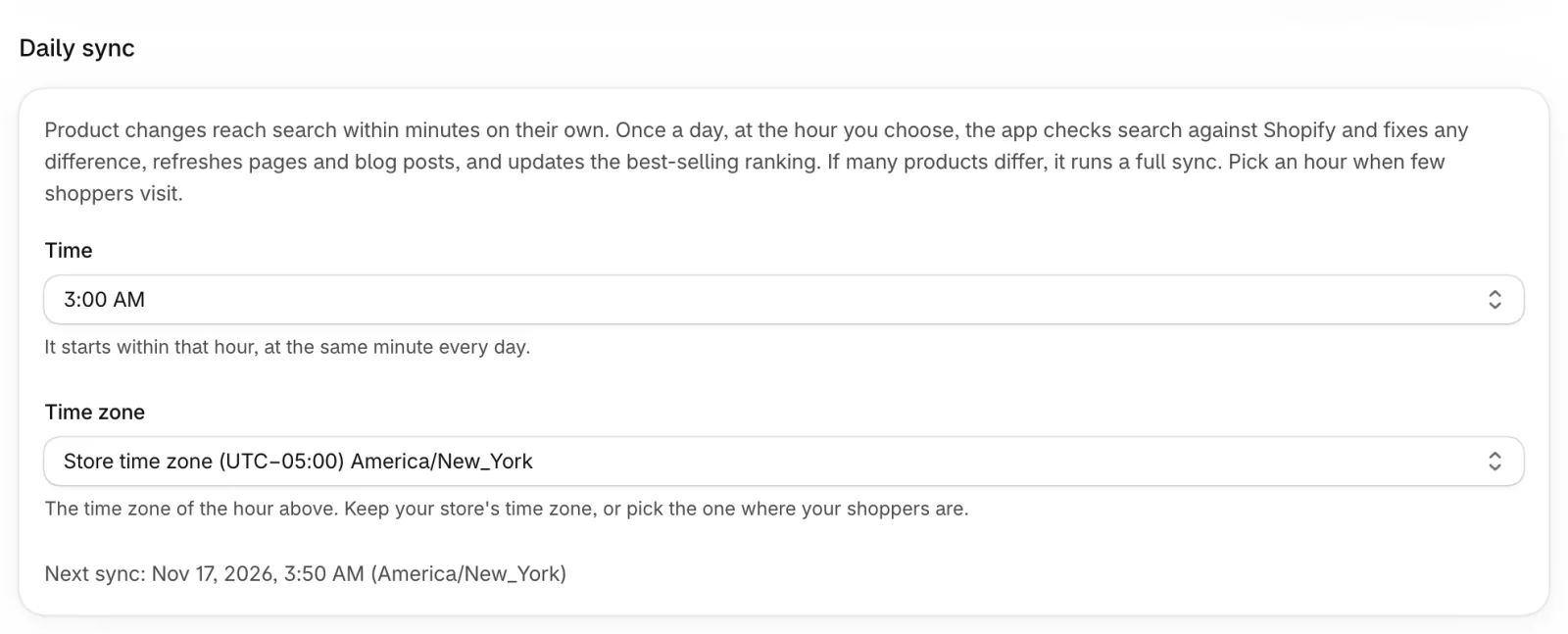
| Option | What it does | Default |
|---|---|---|
| Time | The hour the daily sync starts. | 3:00 AM |
| Time zone | The time zone of that hour. Store time zone follows your store's setting in Shopify, even if you change it later. | Store time zone |
History and troubleshooting#
History lists recent jobs: Full sync, Changes, Reconcile, Daily check and Reindex, with their status, duration and number of products.
If a sync fails, a banner explains what happened and what to do, for example running Sync from Shopify again, or opening the app from Shopify admin if access was lost. While the search service is unavailable, your storefront keeps showing Shopify's own results.
Exclude products#
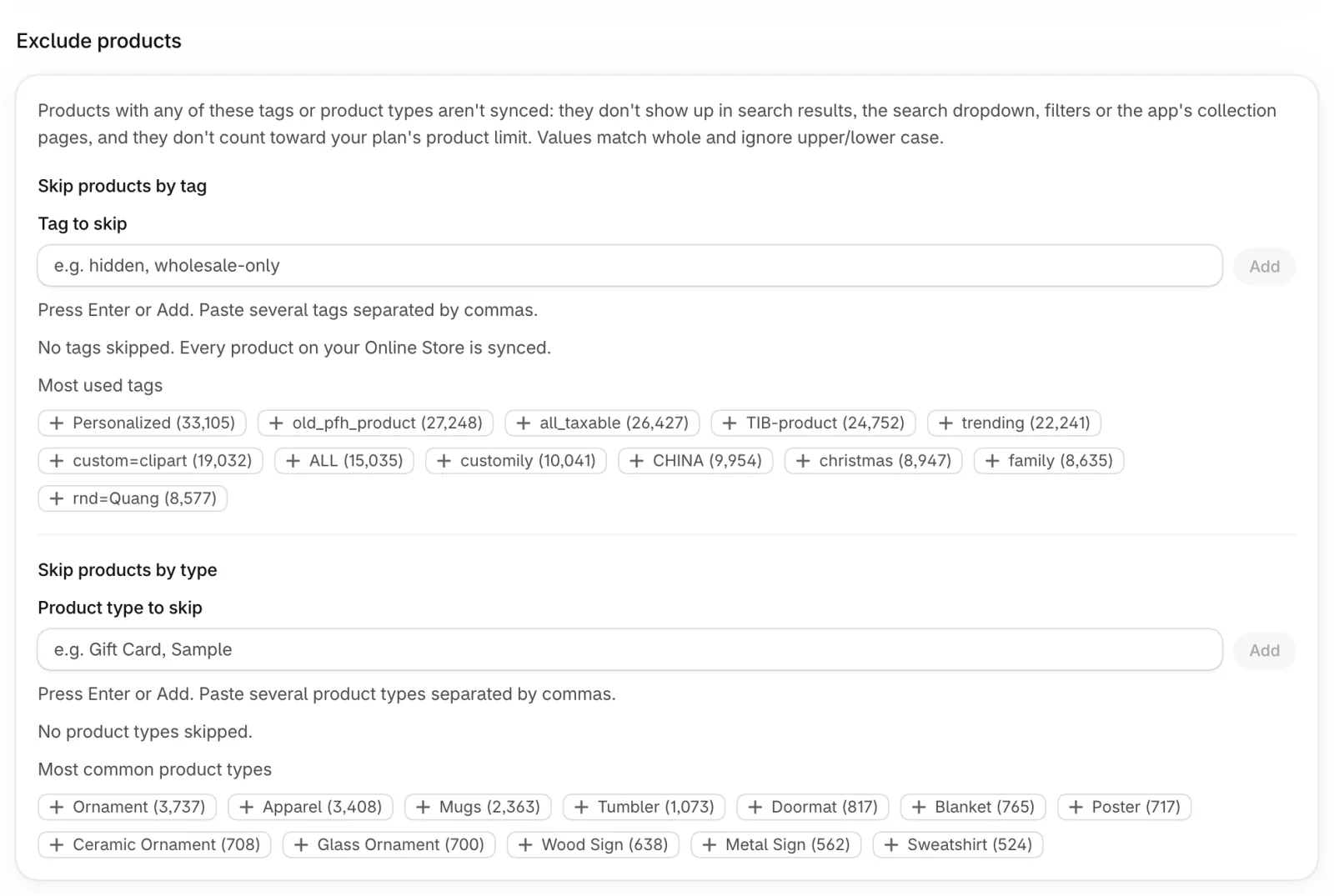
Leave products out of search entirely, by tag or by product type, under Settings → Catalog & sync. Products left out aren't synced: they don't show up in search results, the search dropdown, filters or the app's collection pages, and they don't count toward your plan's product limit. See Skip products by tag and Skip products by type.
One Save applies both lists together.
Skip products by tag#
Products with any of the listed tags aren't synced: they don't show up in search results, instant search, filters or the app's collection pages, and they don't count toward your plan's product limit. Use it for wholesale-only items, hidden gift products, samples and similar.
Type a tag and press Enter or Add (paste several separated by commas), or click one of the Most used tags suggestions, which show how many products have each tag. Tags match whole and ignore upper/lower case: skipping Hidden also skips hidden, but not hidden-gem. Up to 100 tags.
After you save, products with a newly added tag disappear from search right away, with no re-sync. Products whose tag you removed come back within a few minutes: the app fetches only those products again. Tagging or untagging a product in Shopify later takes effect within about a minute. The page shows how many products the last full sync skipped.
Skip products by type#
Products whose product type is in the list aren't synced, exactly like skipped tags: use it for gift cards, samples, service fees and similar. Type a product type and press Enter or Add, or click one of the Most common product types, which show how many products have each type. Types match whole and ignore upper/lower case: skipping Gift Card also skips gift card, but not Gift Card Box. Up to 100 product types; a type that no longer exists in your store stays in the list without harm.
After you save, products of a newly added type disappear from search right away, with no re-sync. Products of a type you removed come back within a few minutes: the app fetches only those products again. Changing a product's type in Shopify later takes effect within about a minute.
Theme setup
Choose the theme you're setting the app up on, and check that the app embed and the blocks are on in it.
Working theme#
Pick the theme you're setting the app up on, for example a copy of your live theme that you'll publish later. The buttons on Overview and Help then open the theme editor on that theme. This page and Overview show whether the app embed and the two blocks are on in it, and Open theme editor opens that theme in the theme editor. After you pick another theme, save to check it.
Your storefront isn't affected: the app runs on whichever theme has the app embed on. An unpublished theme shows the app to shoppers once you publish it.
If the theme list can't be loaded, open the app from Shopify admin and approve access to themes; until then the app uses your live theme. The app only reads themes, it never changes them.
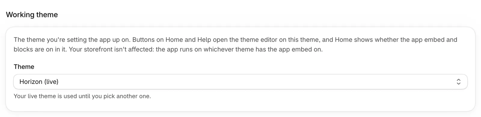
| Option | What it does | Default |
|---|---|---|
| Theme | Your store's live and unpublished themes; the live one is marked. Picking the live theme follows whichever theme is live, even after you publish another one. | Your live theme |
Custom code
Add your own CSS and JavaScript to your storefront without editing your theme. The page has two tabs, CSS and JavaScript.
Custom CSS and JavaScript#
Paste CSS on the CSS tab to restyle the app's search results, filters and search dropdown beyond what Appearance offers, or JavaScript on the JavaScript tab to connect the app to your theme. The code runs on every page of your storefront while the app embed is on, on every plan. Your CSS isn't limited to Kestrel's widgets, so scope your selectors (for example .sa-block) to avoid changing the rest of your theme. The Custom CSS button under Appearance → Advanced opens the CSS tab. Click Save; the change shows the next time a page loads.
The editors check your code as you type. JavaScript with a syntax error is underlined and can't be saved until you fix it. CSS with a syntax error is marked as a warning: browsers skip the broken rule and keep the rest, so you can save it after confirming.
Each tab holds up to 50 KB. Your CSS loads after the app's own styles, so your rules win when they're equally specific. Uninstalling the app removes the code from your storefront; if you install the app again, your saved code goes live again.
Developers: the code runs after window.Kestrel is available and before the app's search widgets load, so it can listen to every searchapp: event. See the developer docs for details.
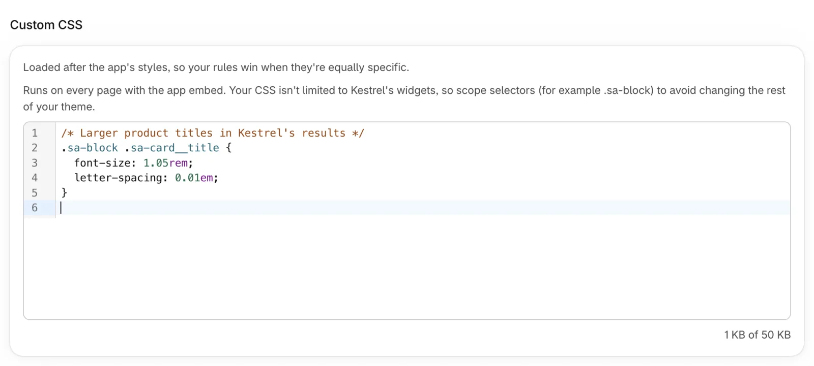
| Option | What it does | Default |
|---|---|---|
| Custom CSS | CSS added to every storefront page with the app embed. | Empty |
| Custom JavaScript | JavaScript that runs once on every storefront page with the app embed. | Empty |
| Run custom JavaScript | Turn off to stop your JavaScript on the storefront without deleting it, for example while you look for a problem. | On |
| Insert example | Adds ready-made JavaScript: update the cart count after an add, show a message when an add fails, log search results. | — |
Update your cart after Add to cart#
With Add to cart button on (Appearance → Product cards), shoppers add products from the product cards. Themes update their cart count and cart drawer in different ways, so the app doesn't change them. Click Insert example → Update the cart count after an add, change the selector in the first line to your theme's cart count element if needed, and save: the count updates after each add.
Notifications
Emails the app sends to your store's email address.
Email notifications#
Kestrel emails your store's email address (Shopify Settings → General) in these cases: once after you install the app, with the three theme steps that make search live; on the Free plan, sometimes one more email a little later with a discount code for your first plan (once per store, even if you install the app again); and when you publish a theme, saying whether the app embed and both blocks are on in it, with links that open that theme in the theme editor.
App embeds and blocks are turned on per theme, so a newly published theme can show your theme's own search until you turn them on there. Publishing several themes within an hour sends one email. Your settings in the app are kept either way.
Emails are in English. Every email has an Unsubscribe link, which turns this switch off.

| Option | What it does | Default |
|---|---|---|
| Email me about my store's search | Sends the welcome email, the discount code email and the theme-published emails. Turn it off to stop them. | On |
Developers
Credentials and examples for theme developers and custom storefronts.
API access#
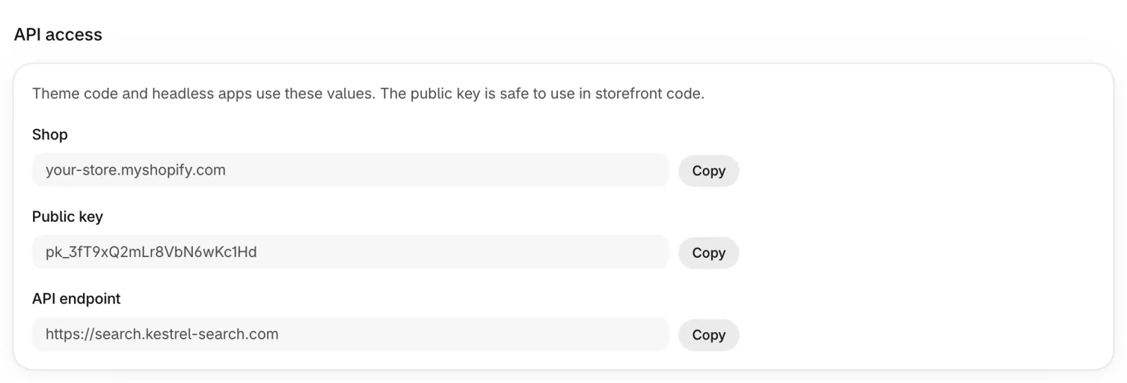
Shows your shop, public key and API endpoint. The public key is safe to use in storefront code. Code examples show how to use the JavaScript SDK (window.Kestrel, available once the app embed is on), how to override a template in a theme section and how to call the API from a headless app. The full reference is in the developer docs.
Headless accessPro plan and up#
| Option | What it does | Default |
|---|---|---|
| Allow headless requests | Lets a custom storefront or mobile app call the search API. Requests from your own storefront domains always work. | Off |
| Allowed browser origins (optional) | One per line, like https://www.example.com. Empty allows any origin. Server-to-server requests aren't affected. | — |
Help and common questions
Setup shortcuts, answers to common questions and how to reach support.
Help page#
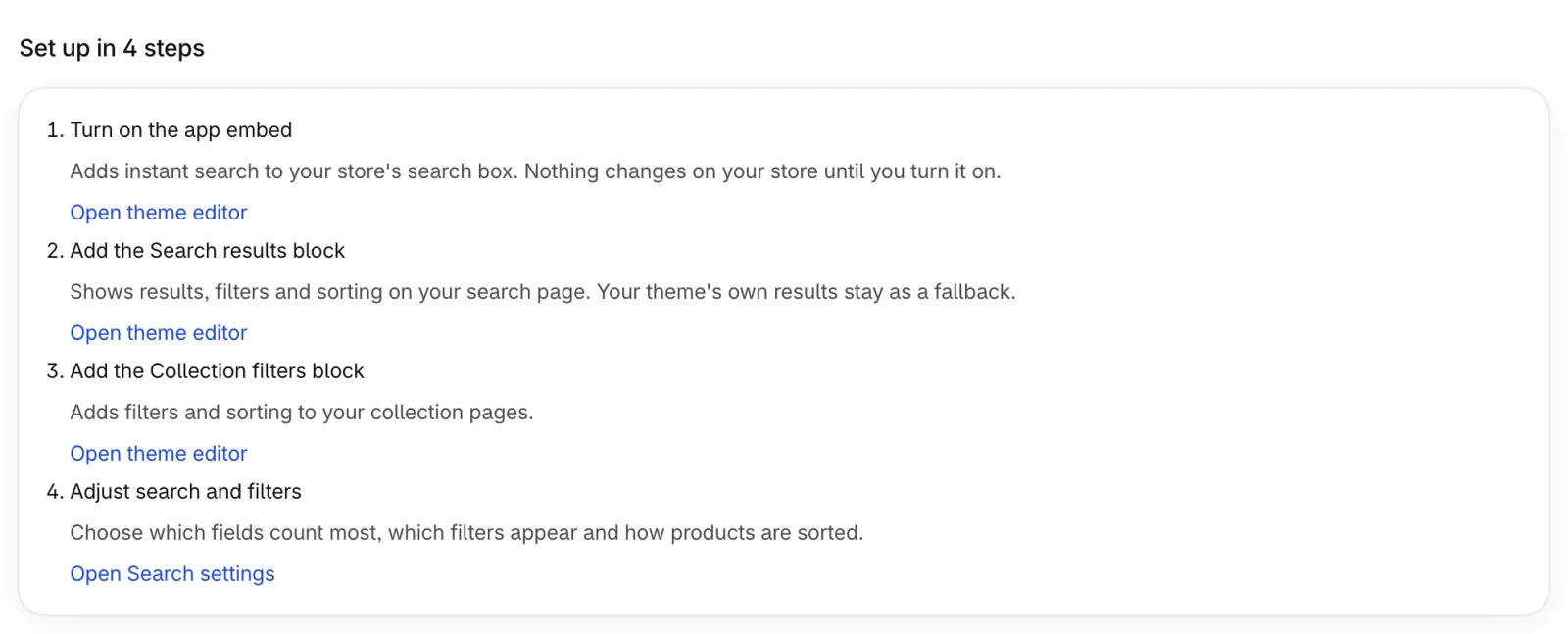
The Help button at the top of every Settings page opens it. It lists the four setup steps with buttons that open the theme editor at the right place, common questions, and Contact support with buttons to email support, open this user guide and open the developer docs.
Live chat supportBasic plan and up#
On the Basic and Pro plans you can chat with our team without leaving the app: click the round chat button at the bottom right of any page, Get support at the top of the app, or Chat with us on the Help page. We see your store and plan, so you don't need to explain your setup. Pro stores' chats are answered first.
Chat history is kept for 30 days. Outside our working hours the chat shows when we'll reply. On the Free plan, Get support opens the Help page, where you can email us.
What do shoppers see if the app is unavailable?#
Your theme's own search and collection results. The blocks show them first and the app enhances them, so shoppers always see products.
Does it work with my theme?#
It works with Online Store 2.0 themes through app blocks and the app embed, without editing theme code. Colors and texts are changed under Appearance.
What happens if I uninstall?#
Remove the blocks from your theme first. After uninstalling, your store goes back to Shopify's search, and the app deletes your product search data. Your settings and plan history are kept: if you reinstall, your setup comes back after a new sync. A free trial you already used doesn't start again.
Custom development#
Need the app to work differently for your store? We can customize it the way you want. Tell us what you need by email (the address is on the Help page in the app), or in the app's chat on the Basic and Pro plans.
Plans and billing
Every plan, Free included, has search, filters, sorting, synonyms, redirects, stop words, best-selling from your orders and filtering and sorting by market prices. There are two paid plans: Basic adds merchandising and 1,000 AI searches a month, and Pro has everything in Basic plus the features below and 5,000 AI searches a month. On either plan you pick the catalog size you need, and you can buy extra AI credits whenever you need them. Catalogs under 100 products can use the Free plan. Every store starts with a 7-day free trial with every feature.
| Catalog size | Free | Basic | Pro |
|---|---|---|---|
| Up to 99 | Free | — | — |
| Up to 1,000 | — | $19/mo | $29/mo |
| Up to 5,000 | — | $29/mo | $39/mo |
| Up to 15,000 | — | $39/mo | $59/mo |
| Up to 30,000 | — | $49/mo | $79/mo |
| Up to 50,000 | — | $59/mo | $99/mo |
| Up to 100,000 | — | $89/mo | $149/mo |
| Feature | Free | Basic | Pro |
|---|---|---|---|
| Analytics | 7 days | 30 days | 365 days |
| Pin, boost, bury and hide | — | ✓ | ✓ |
| Search in every store language | — | — | ✓ |
| Best-selling from your orders | ✓ | ✓ | ✓ |
| Filter and sort by market prices | ✓ | ✓ | ✓ |
| AI search | — | — | ✓ |
| Headless API access | — | — | ✓ |
| Add to cart on product cards | — | — | ✓ |
| Live chat support | — | ✓ | ✓ |
| Priority support | — | — | ✓ |
Free trial. Every store gets one 7-day free trial with every feature from the moment it installs Kestrel, development stores included; reinstalling doesn't start a new one. Settings → Subscription shows the days left. Choose a plan any time during the trial: you're only charged once the trial is over. If the trial ends without a plan, your store moves to the Free plan and your settings are kept. Shopify bills one charge every 30 days or once a year (yearly costs 10 months): the plan price, which covers 1,000 products, plus the extra price of your catalog size. Extra AI credits are a separate one-time charge. You approve every charge on Shopify.
Under Settings → Subscription, drag the Your catalog size slider to the catalog size you need. The marks go from 1,000 to 100,000 products; marks smaller than your current catalog are locked. If your catalog is larger than 100,000 products, the page asks you to contact us for a plan made for your store. Below it, the Basic and Pro cards show the total for that size and how it splits: the plan price plus the extra for your catalog size. Compare plans in detail opens the full table. You can switch between Monthly and Yearly, enter a discount code before continuing to Shopify, and see how many products you use compared with your plan's limit and, on a plan with AI searches, how many AI searches you've used this cycle and when they reset. When Kestrel runs an offer, it's listed at the top of the page with a countdown to its end date and a button that copies the code. Some discount codes only work with monthly or with yearly billing; the Subscription page tells you when a code doesn't match the billing you chose. To change the catalog size later, choose it and click Update plan, then approve the new total on Shopify.
Extra AI credits: on any plan with AI searches, the AI credits card shows your monthly and extra credits and your purchase history. Buy extra AI credits opens a window: slide to a pack (for example 5,000 credits), check the total after purchase and click Checkout; you approve a one-time charge on Shopify and the credits are added when you come back. Buy again whenever you need; credits add up and never expire, also when you change plan. On the Free plan, or any plan without AI searches, AI rescue pauses and your extra credits are kept for when you switch back. Discount codes don't apply to credit packs.
Development stores and stores on a Shopify trial work like any other store: the same one free trial, then features and the product limit follow the plan you choose, and the Free plan includes up to 99 products. Billing goes through Shopify's approval page, the same as on any store.
Changing mid-cycle. Your plan stays one charge. Moving up (a bigger catalog size or Pro) replaces it with a charge for the new total right away: Shopify's approval page shows the new price, and for the rest of the billing cycle you pay only the difference for the days left, because Shopify credits the unused part of your current plan. The confirmation shows an estimate before you continue. For example, on Basic 5,000 ($29) with 20 of 30 days left, moving to 15,000 ($39) costs about (39 − 29) × 20/30 = $6.67 more this cycle, then $39 from your next billing date. Moving down (a smaller catalog size or Pro to Basic) also applies right away, and Shopify credits the unused part of your current plan to your Shopify bill: from Basic 15,000 ($39) to 5,000 ($29) with 20 days left, the credit is about (39 − 29) × 20/30 = $6.67. From yearly to monthly billing, Shopify starts the monthly charge when the paid year ends. During the free trial nothing is charged, changes apply right away and the trial keeps its days left. A discount you have keeps applying to the new charge for the cycles it has left, unless it doesn't cover the new plan or you switch between monthly and yearly billing; the confirmation tells you. If your subscription still has a monthly AI pack bought before November 2026, it ends with your next change and the confirmation tells you; buy one-time credits instead. If the Kestrel team gave your store a complimentary plan, paying for a plan ends it.
You can change or cancel at any time under Settings → Subscription. Switching to Free cancels the subscription right away and keeps your settings. Before you move to a smaller plan, the confirmation lists the features that plan doesn't include; they turn off when you switch, and their settings are kept so they come back if you upgrade again.
On a paid plan, if your catalog grows past the limit or you move to a plan with a lower limit, search keeps working for all products for 14 days. After that, search keeps as many products as your plan includes (oldest first) and removes the rest; Overview and Settings → Subscription tell you how many. The Free plan has no grace period: a catalog larger than 99 products keeps its 99 oldest in search right away. While some products are outside your plan, collection pages show your theme's own product grid without the app's filters, and a search that finds nothing in the app shows your theme's results, so shoppers never see fewer products than your theme would show. Upgrading adds the rest back with a full sync. Products skipped by tag don't count.
This guide follows the current version of the app.